Amazon product reviews and ratings are a very important business. Customers on Amazon often make purchasing decisions based on those reviews, and a single bad review can cause a potential purchaser to reconsider. A couple years ago, I wrote a blog post titled A Statistical Analysis of 1.2 Million Amazon Reviews, which was well-received.
Back then, I was only limited to 1.2M reviews because attempting to process more data caused out-of-memory issues and my R code took hours to run.
Apache Spark, which makes processing gigantic amounts of data efficient and sensible, has become very popular in the past couple years (for good tutorials on using Spark with Python, I recommend the free eDX courses). Although data scientists often use Spark to process data with distributed cloud computing via Amazon EC2 or Microsoft Azure, Spark works just fine even on a typical laptop, given enough memory (for this post, I use a 2016 MacBook Pro/16GB RAM, with 8GB allocated to the Spark driver).
I wrote a simple Python script to combine the per-category ratings-only data from the Amazon product reviews dataset curated by Julian McAuley, Rahul Pandey, and Jure Leskovec for their 2015 paper Inferring Networks of Substitutable and Complementary Products. The result is a 4.53 GB CSV that would definitely not open in Microsoft Excel. The truncated and combined dataset includes the user_id of the user leaving the review, the item_id indicating the Amazon product receiving the review, the rating the user gave the product from 1 to 5, and the timestamp indicating the time when the review was written (truncated to the Day). We can also infer the category of the reviewed product from the name of the data subset.
Afterwards, using the new sparklyr package for R, I can easily start a local Spark cluster with a single spark_connect() command and load the entire CSV into the cluster in seconds with a single spark_read_csv() command.
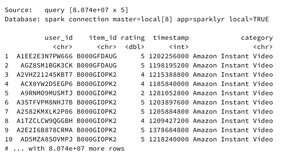
There are 80.74 million records total in the dataset, or as the output helpfully reports, 8.074e+07 records. Performing advanced queries with traditional tools like dplyr or even Python’s pandas on such a dataset would take a considerable amount of time to execute.
With sparklyr, manipulating actually-big-data is just as easy as performing an analysis on a dataset with only a few records (and an order of magnitude easier than the Python approaches taught in the eDX class mentioned above!).
Exploratory Analysis
(You can view the R code used to process the data with Spark and generate the data visualizations in this R Notebook)
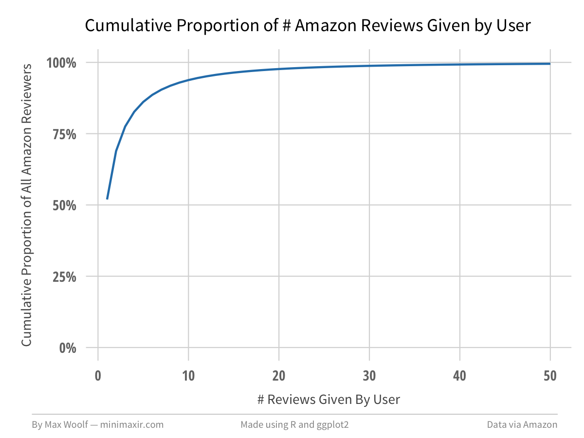
There are 20,368,412 unique users who provided reviews in this dataset. 51.9% of those users have only written one review.
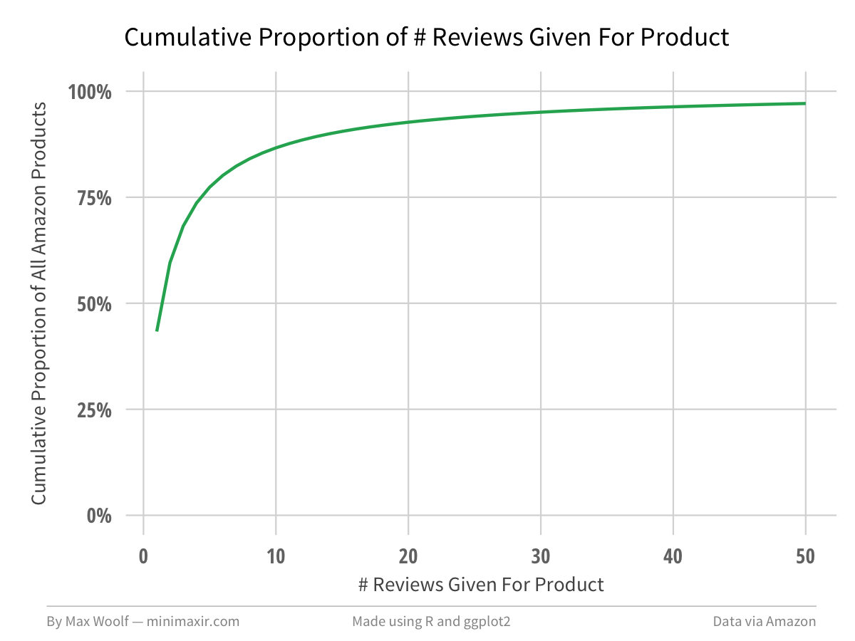
Relatedly, there are 8,210,439 unique products in this dataset, where 43.3% have only one review.
After removing duplicate ratings, I added a few more features to each rating which may help illustrate how review behavior changed over time: a ranking value indicating the # review that the author of a given review has written (1st review by author, 2nd review by author, etc.), a ranking value indicating the # review that the product of a given review has received (1st review for product, 2nd review for product, etc.), and the month and year the review was made.
The first two added features require a very large amount of processing power, and highlight the convenience of Spark’s speed (and the fact that Spark uses all CPU cores by default, while typical R/Python approaches are single-threaded!)
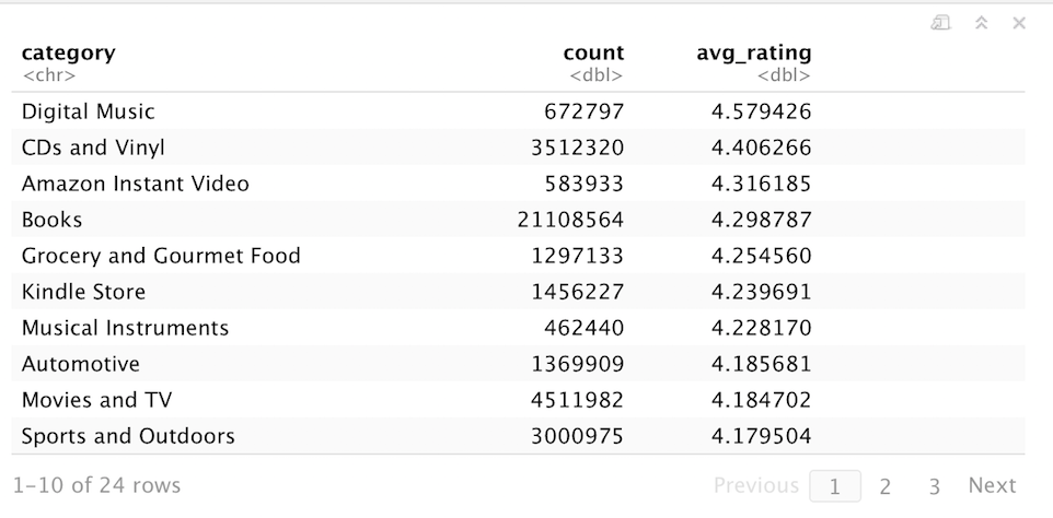
These changes are cached into a Spark DataFrame df_t. If I wanted to determine which Amazon product category receives the best review ratings on average, I can aggregate the data by category, calculate the average rating score for each category, and sort. Thanks to the power of Spark, the data processing for this many-millions-of-records takes seconds.
df_agg <- df_t %>%
            group_by(category) %>%
            summarize(count = n(), avg_rating = mean(rating)) %>%
            arrange(desc(avg_rating)) %>%
            collect()
Or, visualized in chart form using ggplot2:
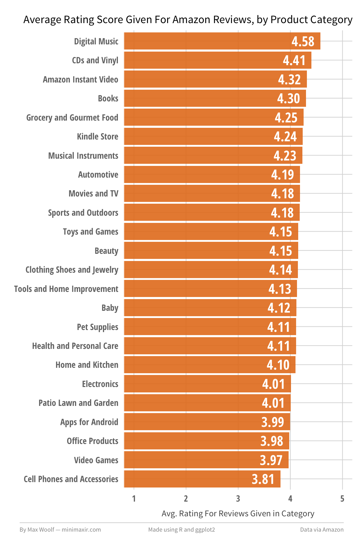
Digital Music/CD products receive the highest reviews on average, while Video Games and Cell Phones receive the lowest reviews on average, with a 0.77 rating range between them. This does make some intuitive sense; Digital Music and CDs are types of products where you know exactly what you are getting with no chance of a random product defect, while Cell Phones and Accessories can have variable quality from shady third-party sellers (Video Games in particular are also prone to irrational review bombing over minor grievances).
We can refine this visualization by splitting each bar into a percentage breakdown of each rating from 1-5. This could be plotted with a pie chart for each category, however a stacked bar chart, scaled to 100%, looks much cleaner.
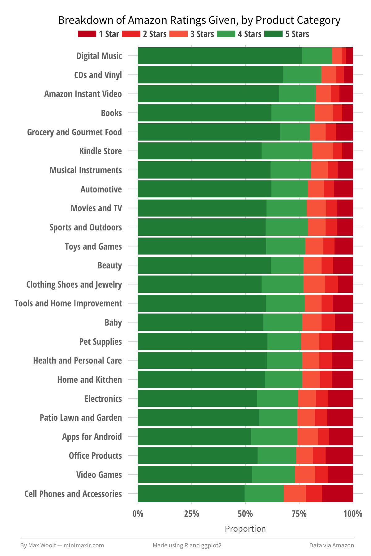
The new visualization does help support the theory above; the top categories have a significantly higher percentage of 4/5-star ratings than the bottom categories, and a much a lower proportion of 1/2/3-star ratings. The inverse holds true for the bottom categories.
How have these breakdowns changed over time? Are there other factors in play?
Rating Breakdowns Over Time
Perhaps the advent of the binary Like/Dislike behaviors in social media in the 2000’s have translated into a change in behavior for a 5-star review system. Here are the rating breakdowns for reviews written in each month from January 2000 to July 2014:
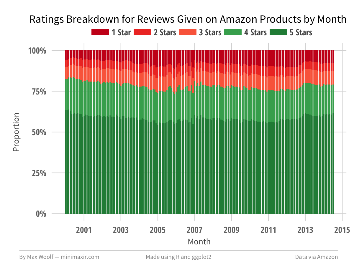
The voting behavior oscillates very slightly over time with no clear spikes or inflection points, which dashes that theory.
Distribution of Average Scores
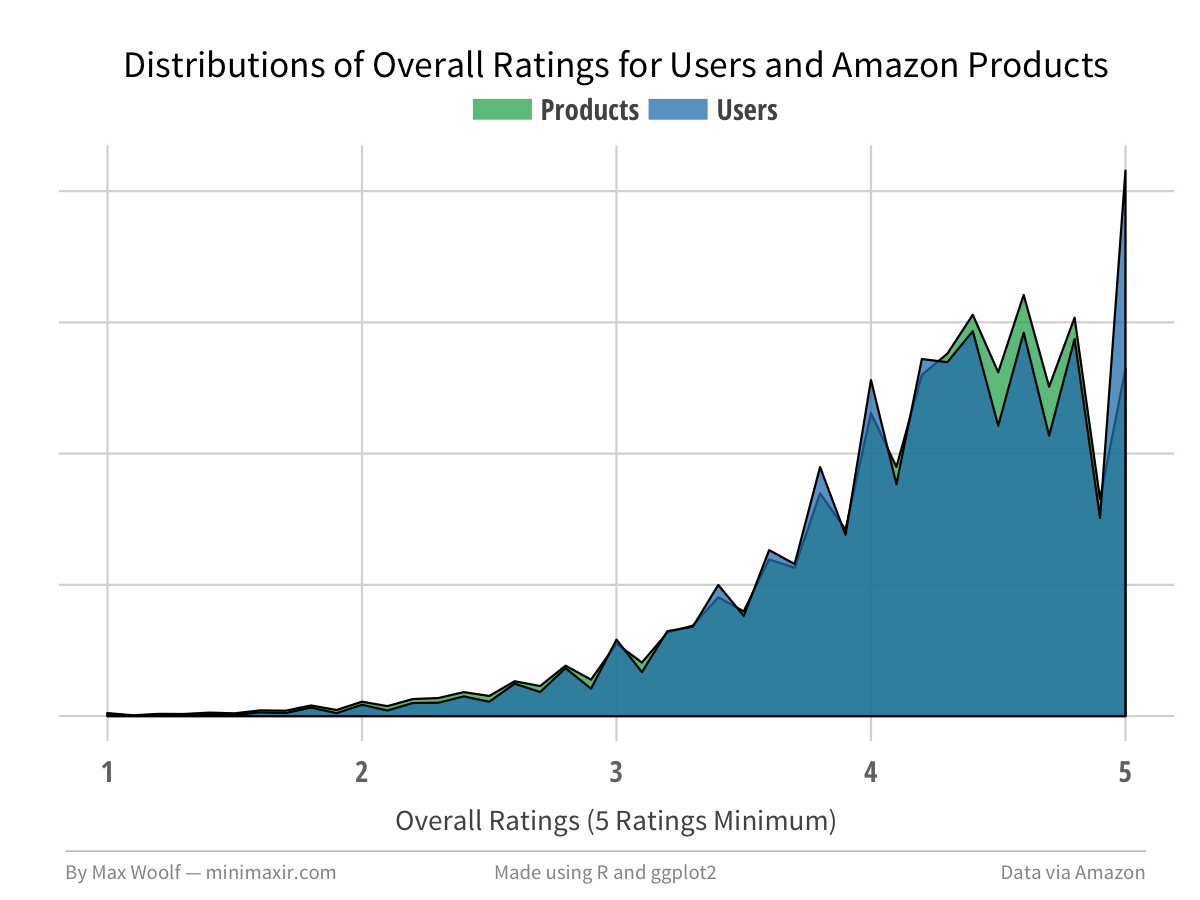
We should look at the global averages of Amazon product scores (i.e. what customers see when they buy products), and the users who give the ratings. We would expect the distributions to match, so any deviations would be interesting.
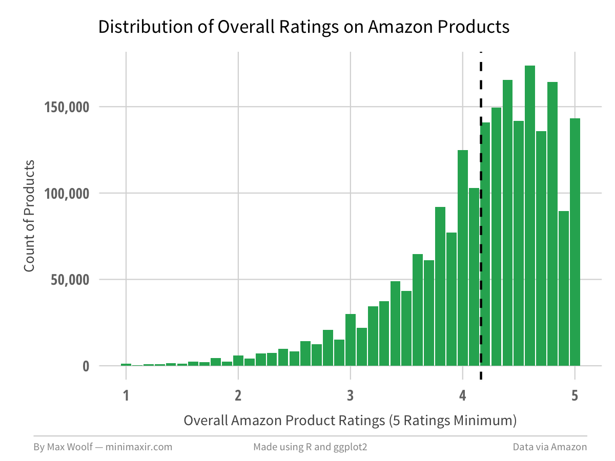
Products on average, when looking at products with atleast 5 ratings, have a 4.16 overall rating.
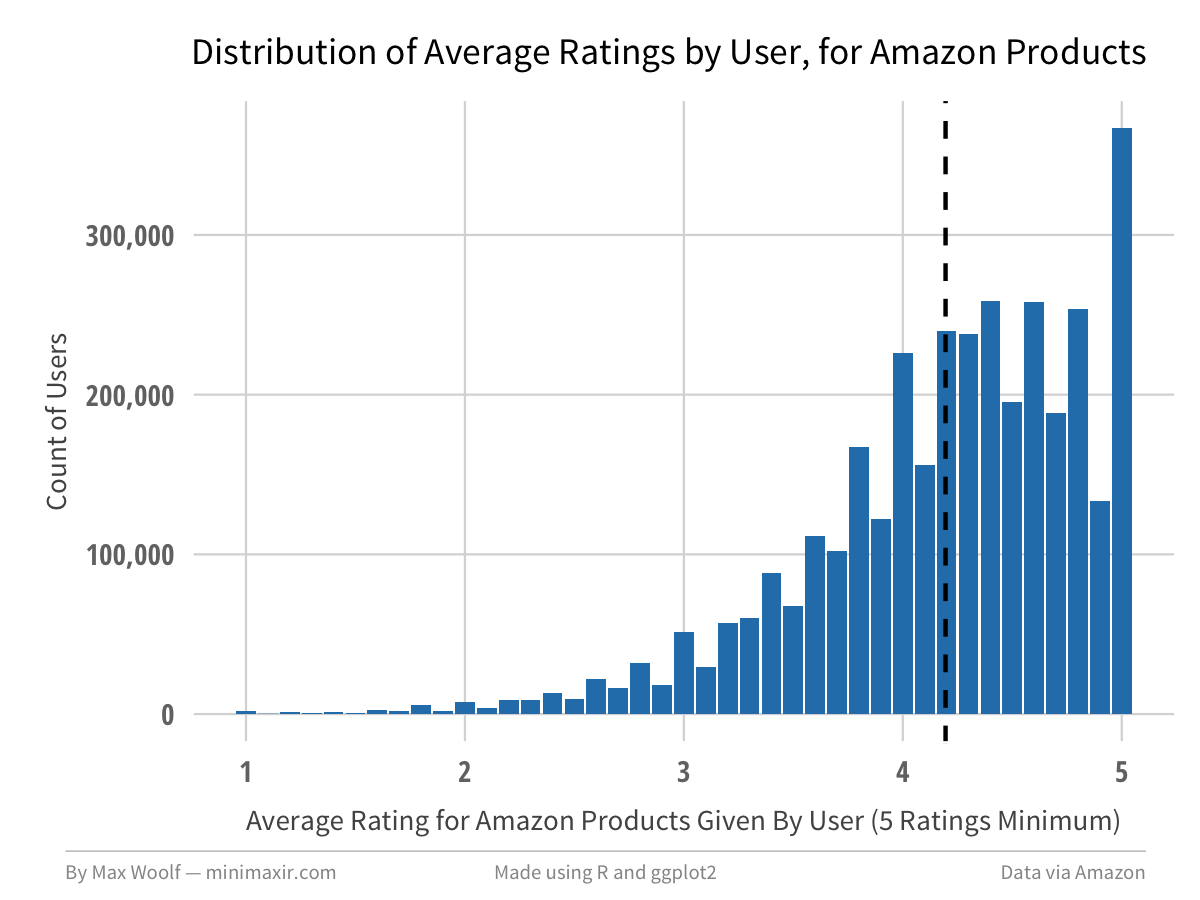
When looking at a similar graph for the overall ratings given by users, (5 ratings minimum), the average rating is slightly higher at 4.20.
The primary difference between the two distributions is that there is significantly higher proportion of Amazon customers giving only 5-star reviews. Normalizing and overlaying the two charts clearly highlights that discrepancy.
The Marginal Review
A few posts ago, I discussed how the first comment on a Reddit post has dramatically more influence than subsequent comments. Does user rating behavior change after making more and more reviews? Is the typical rating behavior different for the first review of a given product?
Here is the ratings breakdown for the n-th Amazon review a user gives:
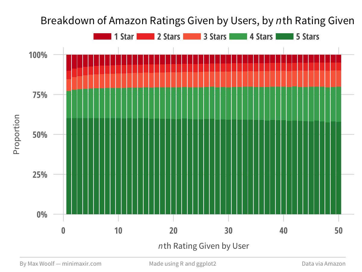
The first user review has a slightly higher proportion of being a 1-star review than subsequent reviews. Otherwise, the voting behavior is mostly the same overtime, although users have an increased proportion of giving a 4-star review instead of a 5-star review as they get more comfortable.
In contrast, here is the ratings breakdown for the n-th review an Amazon product received:
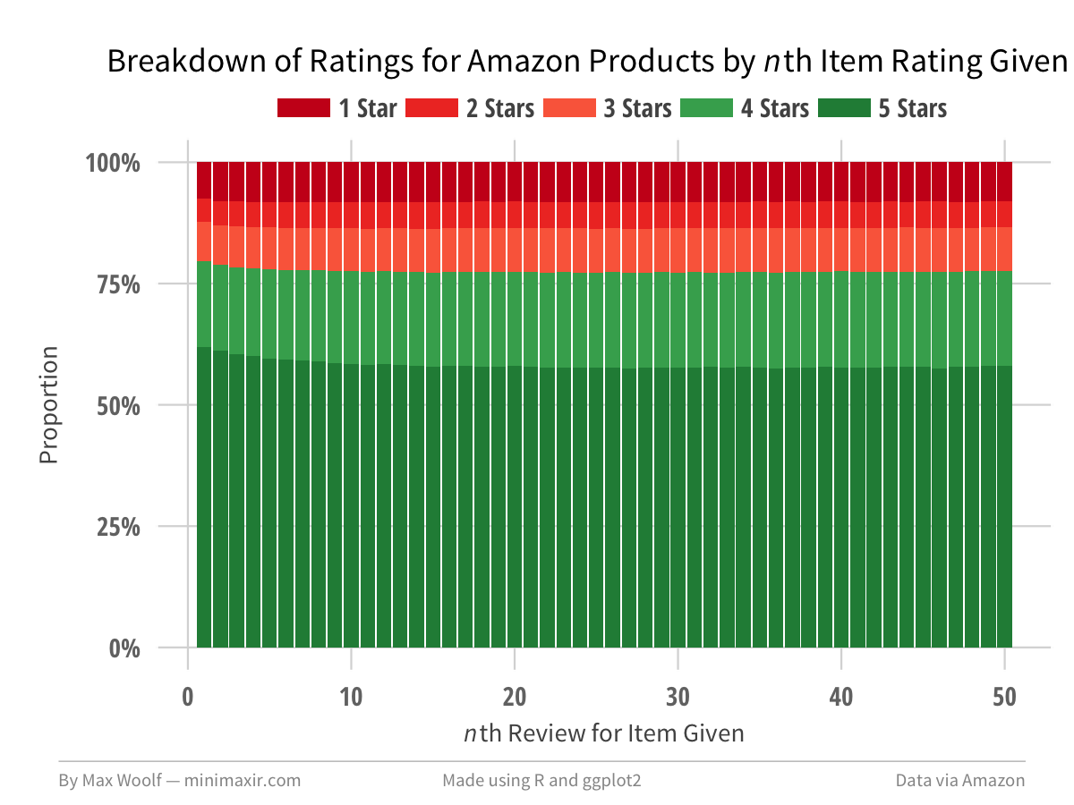
The first product review has a slightly higher proportion of being a 5-star review than subsequent reviews. However, after the 10th review, there is zero change in the distribution of ratings, which implies that the marginal rating behavior is independent from the current score after that threshold.
Summary
Granted, this blog post is more playing with data and less analyzing data. What might be interesting to look into for future technical posts is conditional behavior, such as predicting the rating of a review given the previous ratings on that product/by that user. However, this post shows that while “big data” may be an inscrutable buzzword nowadays, you don’t have to work for a Fortune 500 company to be able to understand it. Even with a data set consisting of 5 simple features, you can extract a large number of insights.
And this post doesn’t even look at the text of the Amazon product reviews or the metadata associated with the products! I do have a few ideas lined up there which I won’t spoil.
You can view all the R and ggplot2 code used to visualize the Amazon data in this R Notebook. You can also view the images/data used for this post in this GitHub repository.
You are free to use the data visualizations from this article however you wish, but it would be greatly appreciated if proper attribution is given to this article and/or myself!