The new hotness in the world of data science is neural networks, which form the basis of deep learning. But while everyone is obsessing about neural networks and how deep learning is magic and can solve any problem if you just stack enough layers, there have been many recent developments in the relatively nonmagical world of machine learning with boring CPUs.
Years before neural networks were the Swiss army knife of data science, there were gradient-boosted machines/gradient-boosted trees. GBMs/GBTs are machine learning methods which are effective on many types of data, and do not require the traditional model assumptions of linear/logistic regression models. Wikipedia has a good article on the advantages of decision tree learning, and visual diagrams of the architecture:
GBMs, as implemented in the Python package scikit-learn, are extremely popular in Kaggle machine learning competitions. But scikit-learn is relatively old, and new technologies have emerged which implement GBMs/GBTs on large datasets with massive parallelization and and in-memory computation. A popular big data machine learning library, H2O, has a famous GBM implementation which, per benchmarks, is over 10x faster than scikit-learn and is optimized for datasets with millions of records. But even faster than H2O is xgboost, which can hit a 5x-10x speed-ups relative to H2O, depending on the dataset size.
Enter LightGBM, a new (October 2016) open-source machine learning framework by Microsoft which, per benchmarks on release, was up to 4x faster than xgboost! (xgboost very recently implemented a technique also used in LightGBM, which reduced the relative speedup to just ~2x). As a result, LightGBM allows for very efficient model building on large datasets without requiring cloud computing or nVidia CUDA GPUs.
A year ago, I wrote an analysis of the types of police arrests in San Francisco, using data from the SF OpenData initiative, with a followup article analyzing the locations of these arrests. Months later, the same source dataset was used for a Kaggle competition. Why not give the dataset another look and test LightGBM out?
Playing With The Data
(You can view the R code used to process the data and generate the data visualizations in this R Notebook)
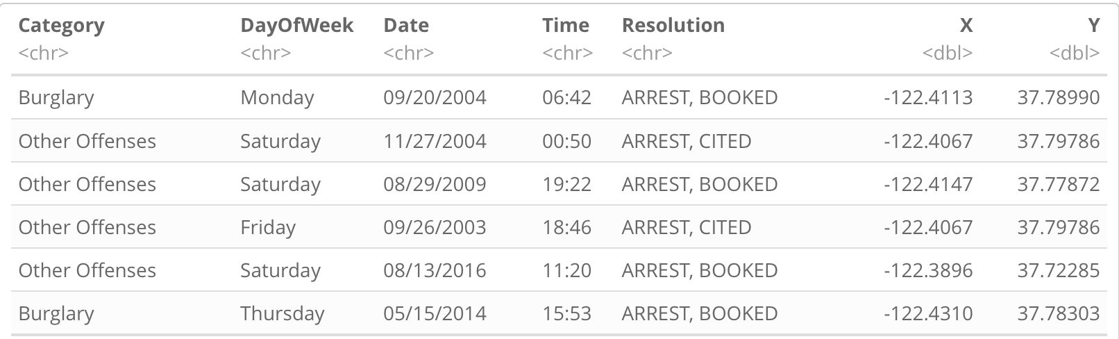
The SFPD Incidents dataset includes crime incidents in San Francisco from 1/1/2003 to 1/17/2017 (at time of analysis). Filtering the dataset only on incidents which resulted in arrests (since most incidents are trivial) leaves a dataset of 634,299 arrests total. The dataset also includes information on the type of crime, the location where the arrest occurred, and the date/time. There are 39 different types of arrests in the Category column such as Assault, Burglary, and Prostitution, which serves as the response variable.
Meanwhile, we can engineer features from the location and date/time. Performing an exploratory data analysis of both is helpful to determine at a glance which features may be relevant (fortunately, I did that a year ago).
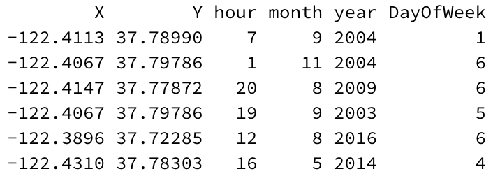
The location is given as latitude/longitude coordinates, so we can select a longitude X and latitude Y as features. Date/Time can be deconstructed further. We can extract the hour in which a given arrest occurred as a feature (hour can take 24 different values from 0 — 23). Likewise, we can extract the month in a similar manner (12 values, from 1 — 12). The year the crime occurred can be extracted without special encoding. (2003 — 2017). It is always helpful to include a year feature in predictive models to help account for change over time. The DayOfWeek is important, but encoding it as a numeric value is tricker; we logically encode each day of the week from 1 — 7, but which day should be #1? Making Monday #1 and Sunday #7 is the most logical, since a decision tree rule that sets a threshold on DayOfWeek values > 5 will translate logically to a weekend.
That’s six features total. There are more features which could be helpful, but let’s check a baseline model as a start.
Modeling
Specifically, the model will predict the answer the question: given that a San Francisco police arrest occurs at a specified time and place, what is the reason for that arrest?
For this post, I will use the R package for LightGBM (which was beta-released in January 2017; it’s extremely cutting edge!) We split the dataset 70%/30% into a training set of 444,011 arrests and a test set of 190,288 arrests (due to the large amount of different category labels, the split must be stratified to ensure the training and test sets have a balanced distribution of labels; in R, this can be implemented with the caret package and createDataPartition).
LightGBM trains the model on the training set and evaluates it on the test set to minimize the multiclass logarithmic loss of the model. For now, I use the default parameters of LightGBM, except to massively increase the number of iterations of the training algorithm, and to stop training the model early if the model stops improving. After about 4 minutes on my laptop (which is very fast for a dataset of this size!), the model returns a multilogloss of 1.98.
That number sounds arbitrary. Is it good or bad? Let’s compare it to the multilogloss from the top models from the Kaggle version of the dataset, where a lower score is better:
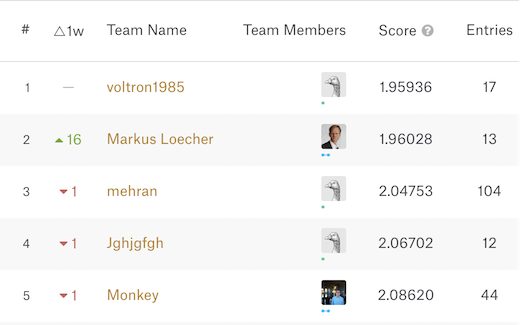
…okay, 1.98 is a good score, and without spending much time adding features to the model and tuning parameters! To be fair, my methodology would not necessarily result in the same score on the Kaggle dataset, but it confirms that the LightGBM model is in the top tier of models available for this problem and dataset context. And it didn’t require any neural networks either!
There are areas for improvement in feature engineering which other entries in the Kaggle competition implemented, such as a dummy variable indicating whether the offense occurred at an intersection and which SF police station was involved in the arrest. We could also encode features such as hour and DayOfWeek as categorical features (LightGBM conveniently allows this without requiring one-hot encoding the features) instead of numeric, but in my brief testing, it made the model worse, interestingly.
Analyzing the LightGBM Model
Another perk of not using a neural network for statistical model building is the ability to learn more about the importance of features in a model, as opposed to it being a black box. In the case of gradient boosting, we can calculate the proportional contribution of each feature to the total information gain of the model, which will help identify the most important features, and potentially unhelpful features:
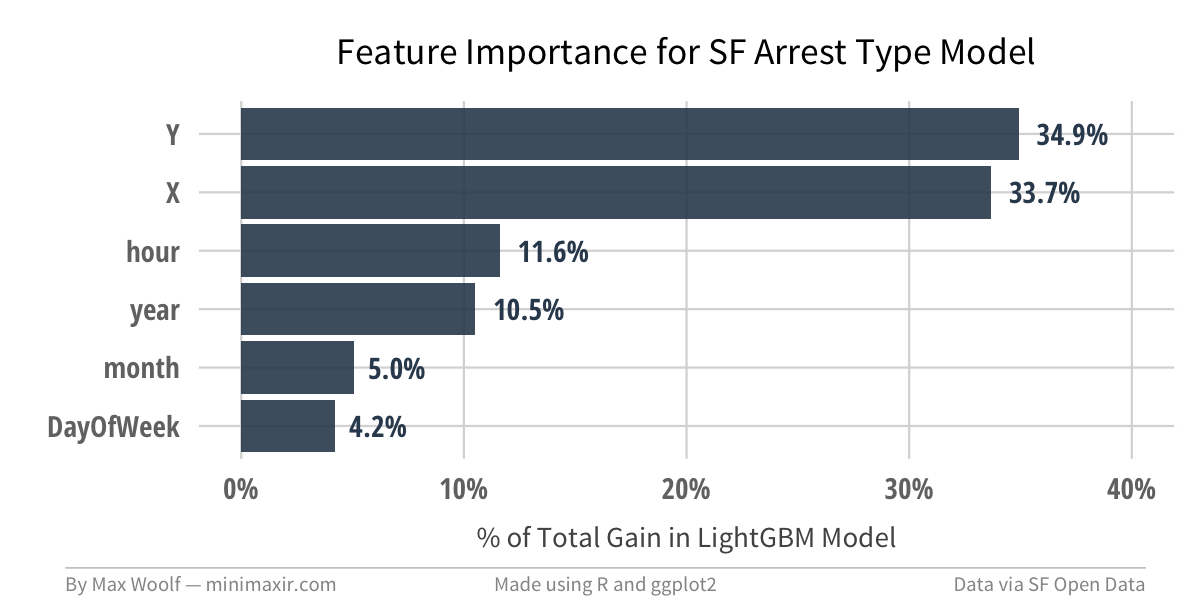
Unsurprisingly, location features are the most important, with both location-based features establishing 70% of the total Gain in the model. But no feature is completely insignificant, which is a good thing.
Back to the multilogloss of 1.98. What does that mean in the real world? What is the accuracy of the model? We run each of the 190,288 arrests in the test set against the model, which returns 39 probability values for each record: one for each possible category of arrest. The category with the highest probability becomes the predicted type of arrest.
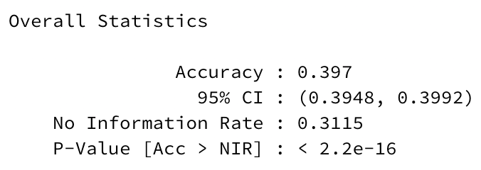
The accuracy of the model on the test set, which is the proportion of predictions where the predicted category value matches the actual category value, is 39.7%, with a 95% confidence interval for the true accuracy between 39.5% and 39.9%. That seems low! However, there is catch-all “Other Offenses” category for an arrest; if you predicted a “Other Offenses” label for all the test-set values, you would get an accuracy of 31.1%, which serves as the No Information Rate (since it would be the highest accuracy approach if there was no information at all). A 8.6 percentage point improvement is still an improvement though; many industries would love an 8.6 percentage point increase in accuracy, but for this context obviously it’s not enough to usher in a Minority Report/Person of Interest future.
We can visualize the classifications on the test set by the model using a confusion matrix; caret has a simple confusionMatrix() function, and ggplot2 has a geom_tile() to map out the relationships, even with 39 classes. We can also annotate the tiles where actual label = predicted label by drawing a geom_point() on top. Putting it all together:
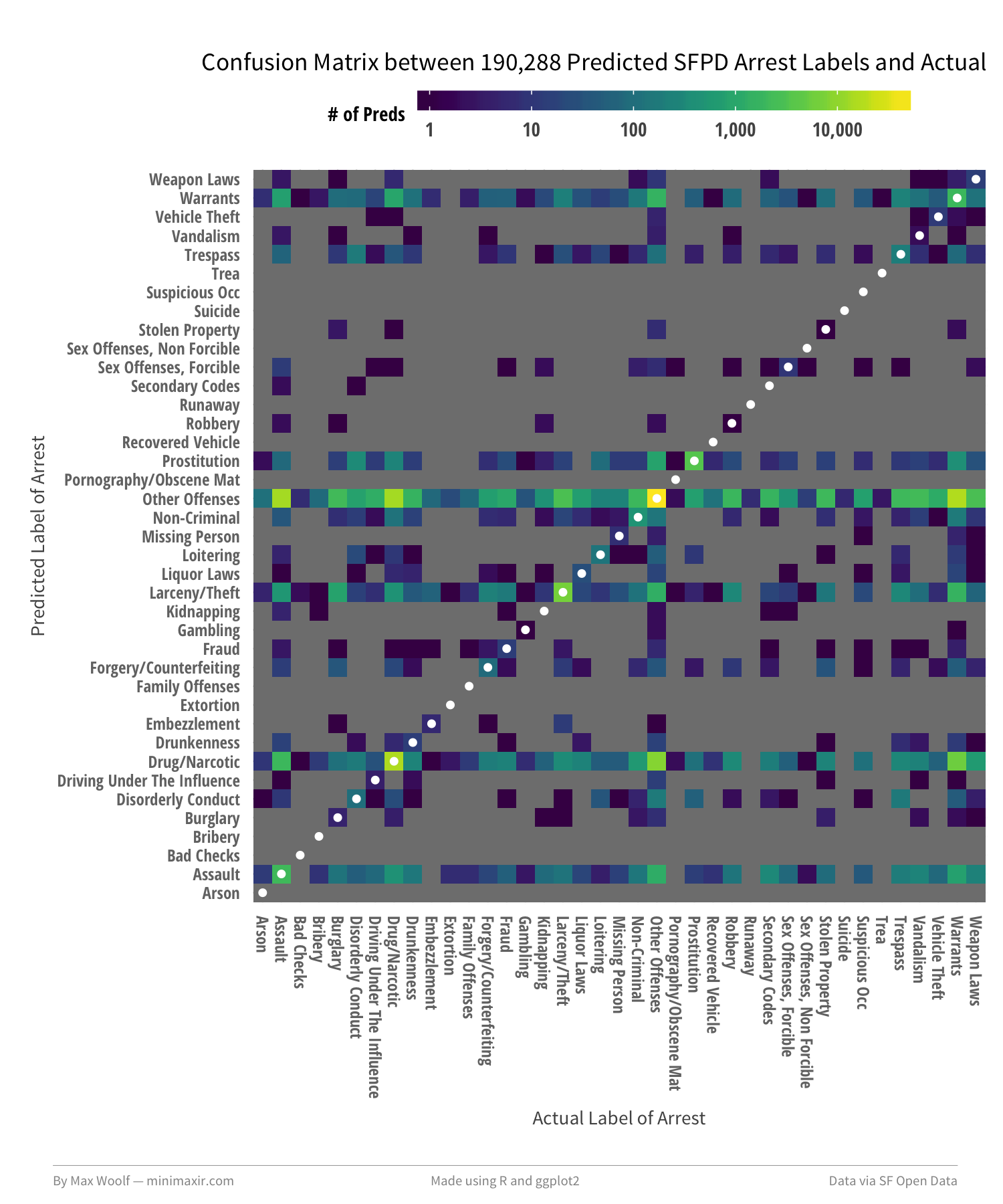
There is, indeed, a large amount of confusion. Many of the labels are mispredicted as Other Offenses. Specifically, the model frequently confuses the combinations of Assault, Drug/Narcotics, Larceny/Theft, and Warrants, suggesting that they also may be catch-alls.
In theory, the predicted probabilities from the model between similar types of crime should also be similar, which may be causing these mispredictions. We can calculate the Pearson correlations between the predicted probabilities, and use hierarchical clustering to arrange and plot the correlations and their labels in a logical order. The majority of the correlations between labels are between 0 and +/- 0.5 (weak to moderate), but their arrangement tells a different story:
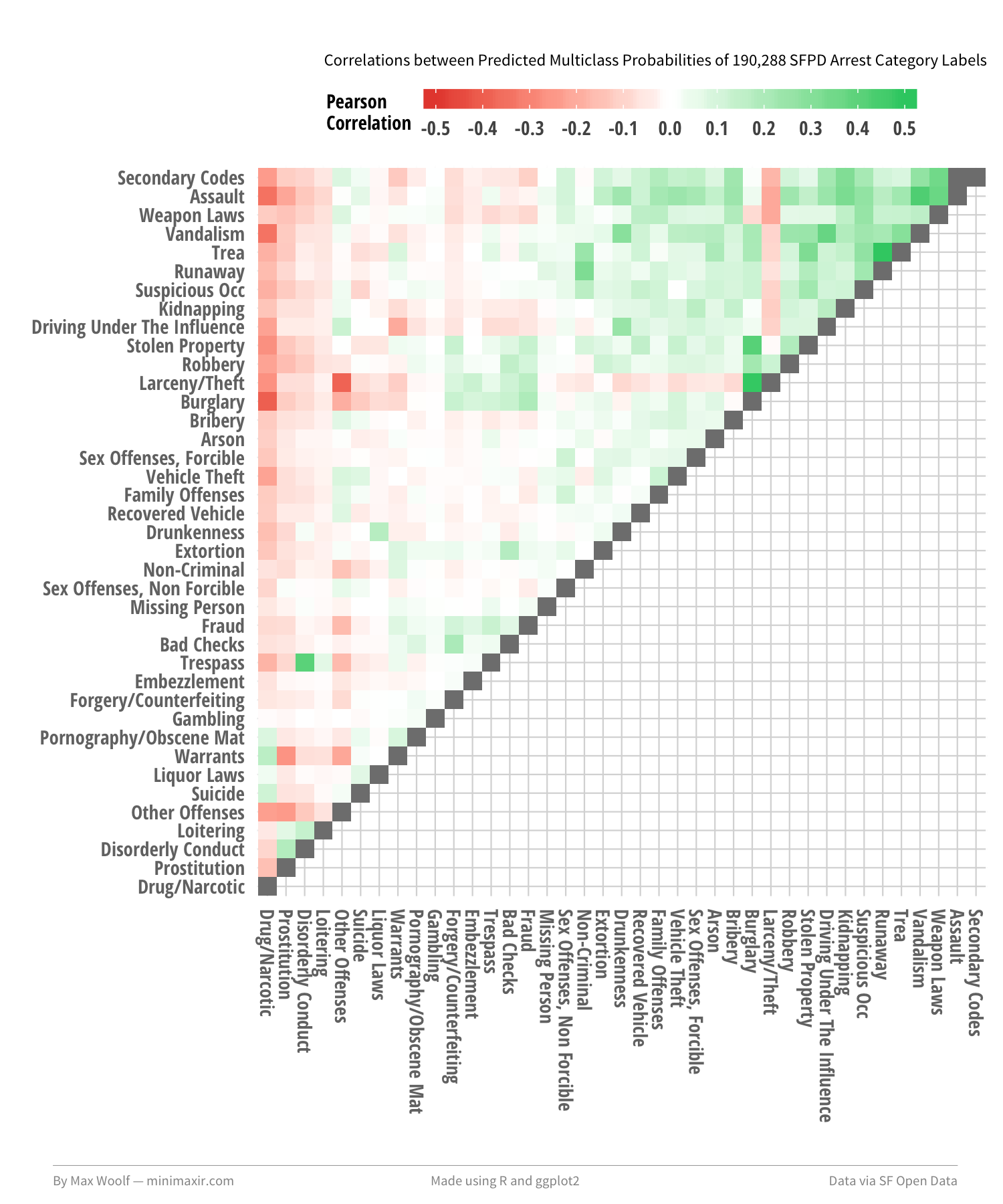
From top to bottom, you can see that there is a grouping of more blue-collar, physical crimes types (Assault, Vandalism), then a grouping of less-physical, white-collar crime types (Bribery, Extortion), and then a smaller grouping of seedier crime types (Liquor Laws, Prostitution).
The visualization doesn’t necessarily provide more information about the confusion matrix and the mispredictions, but it looks cool, which is enough.
Mapping the Predicted Types of Arrests
Kaggle competitions emphasize model creation, but don’t discuss how to implement and execute models in practice. Since we can predict the type of crime based on the given location and date/time of an arrest, we can map boundaries of the mostly likely type of offense. Using ggmap to get a map of San Francisco, splitting San Francisco into tens of thousands of points, and predicting the most-likely type of arrest at the location with a given date/time.
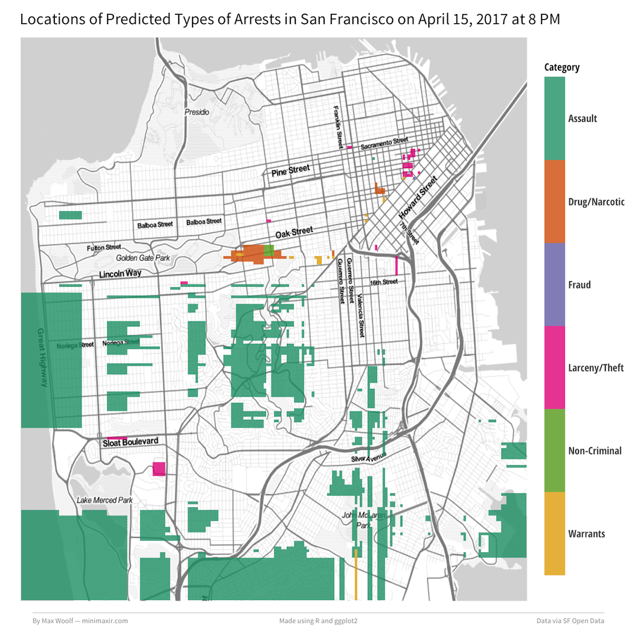
Let’s say we want to predict the types of crime in the future, on April 15th, 2017, during 8 PM. We construct a dataset of those points and the same date/time features used to generate the model originally. Then run those fabricated points through the model again to get new predicted labels (Additionally, we need to remove “Other Offenses” predicted labels since they cloud up the map). Plotting each point as a geom_tile will interpolate regions around the city. Putting it all together:
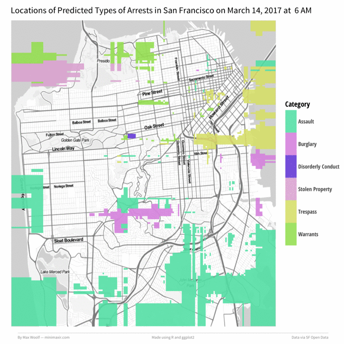
Not too shabby. But that’s not all; we can animate this map over a day by incrementing the hour, generating a map for each hour (while keeping the colors corresponding to the arrest type consistent), and then stitching the maps together into a GIF. Let’s do March 14th, 2017 (Pi Day can be dangerous!) starting at 6 AM:
Wow!
Conclusion
I deliberately avoided using the term “machine learning” in the headline of this post because it has been overused to the point of clickbait. Indeed, neural networks/deep learning excel at processing higher-dimensional data such as text, image, and voice data, but in cases where dataset features are simple and known, neural networks are not necessarily the most pragmatic option. CPU/RAM machine learning libraries like LightGBM are still worthwhile, despite the religious fervor for deep learning.
And there’s still a lot of work that can be done with the SF Crime Incidents dataset. The model only predicts the type of crime given an arrest occurred; it does not predict if an arrest will occur at a given time and place, which would make a fun project for the future!
You can view all the R and ggplot2 code used to visualize the San Francisco crime data in this R Notebook. You can also view the images/data used for this post in this GitHub repository.
You are free to use the data visualizations from this article however you wish, but it would be greatly appreciated if proper attribution is given to this article and/or myself!