One of the reasons I have open-sourced the code for my complicated data visualizations is transparency for the creation process. 2015 was a year of misleading and incorrect data visualizations, and I don’t want to help contribute to the misconception that data can be used for trickery. “Big data” in particular is a area where the steps to reproduce results are rarely released publicly in a step-by-step manner, often in an attempt to make the resulting analysis unimpeachable.
It’s time to take things to the next level of transparency by recording screencasts of my data analysis and visualizations.
Last week, ggplot2 author Hadley Wickham released a surprise update for my favorite R package, bumping the version to 2.0.0. Why not celebrate by playing around with ggplot2 and making some pretty charts?
Let’s Code!
I have recorded a screencast of myself coding in R to play around with data from Yelp Dataset Challenge and uploaded it to YouTube. Additionally, the video can be played at an unusually high quality for screencasting: 1440p on supported browsers, at 60 frames per second.
This particular screencast is also my first significant attempt at working with audio/video editing and voice-over. Feel free to provide suggestions for future videos.
Since the screencast is 40 minutes long (inadvertently!), I’ve written an abridged summary of the screencast, along with some clarification of points made.
Yelp Data v2
A year ago I made a blog post analyzing the same Yelp data. Now that the data set contains 1.6 million reviews (as opposed to just 1.1 million back then), it might be interesting to look at it again to see if anything has changed. The data is formatted as by-line JSON: I wrote a pair of Python scripts to convert it to CSV for easy import into R.
The screencast centralizes on three R packages: readr, dplyr, and ggplot2. (all authored by Hadley Wickham)
Loading the dataset into R is easy and fast with read_csv.
df_reviews <- read_csv("yelp_reviews.csv")
Since dplyr was loaded beforehand, readcsv loads the data into a tbl_df instead of a normal data.frame. When you call a normal data.frame by itself, _all data is printed to console, which is a problem when you have 1.6M rows (yes, that happened during a test recording). Calling a tbl_df results in a very descriptive overview of the data:
Most columns are self-explanatory. review_length is approximate number of words in the review, pos_words is the number of positive words in the review, neg_words is what you expect, net_sentiment is pos_words - neg_words.
A quick way to analyze the distribution of numerical data is to perform a summary on the data frame, which returns a by-column five-number summary + mean:
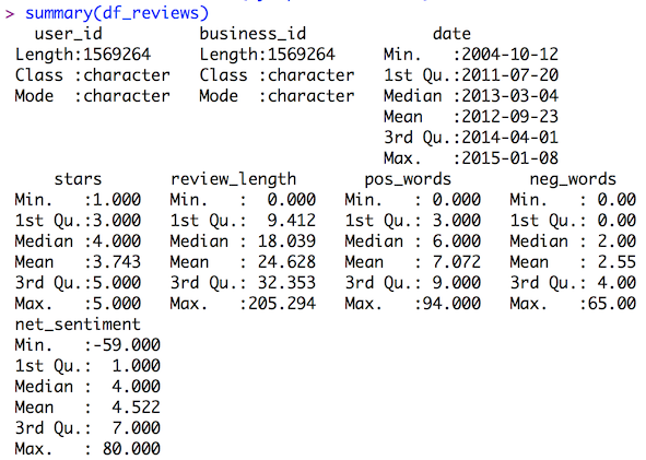
Ratings are biased toward 4 and 5 star reviews. There is a lot of skew for review length.
dplyr makes it easy to add columns in-line with the mutate command. Let’s normalize the pos_words column:
df_reviews <- df_reviews %>% mutate(pos_norm = pos_words / review_length)
And we could do similar steps for the neg_words column too. Or use mutate to transform the data of an existing column.
Onto ggplot2. If you want a quick histogram of univariate data, qplot does just that. Let’s visualize the distribution of stars.
qplot(data=df_reviews, stars)
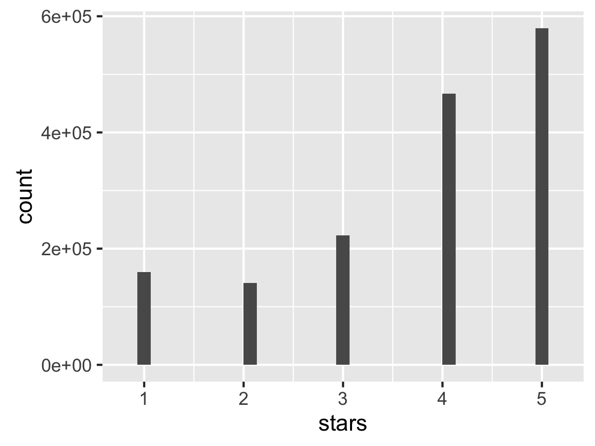
Definitely a skew toward 4 and 5 star reviews.
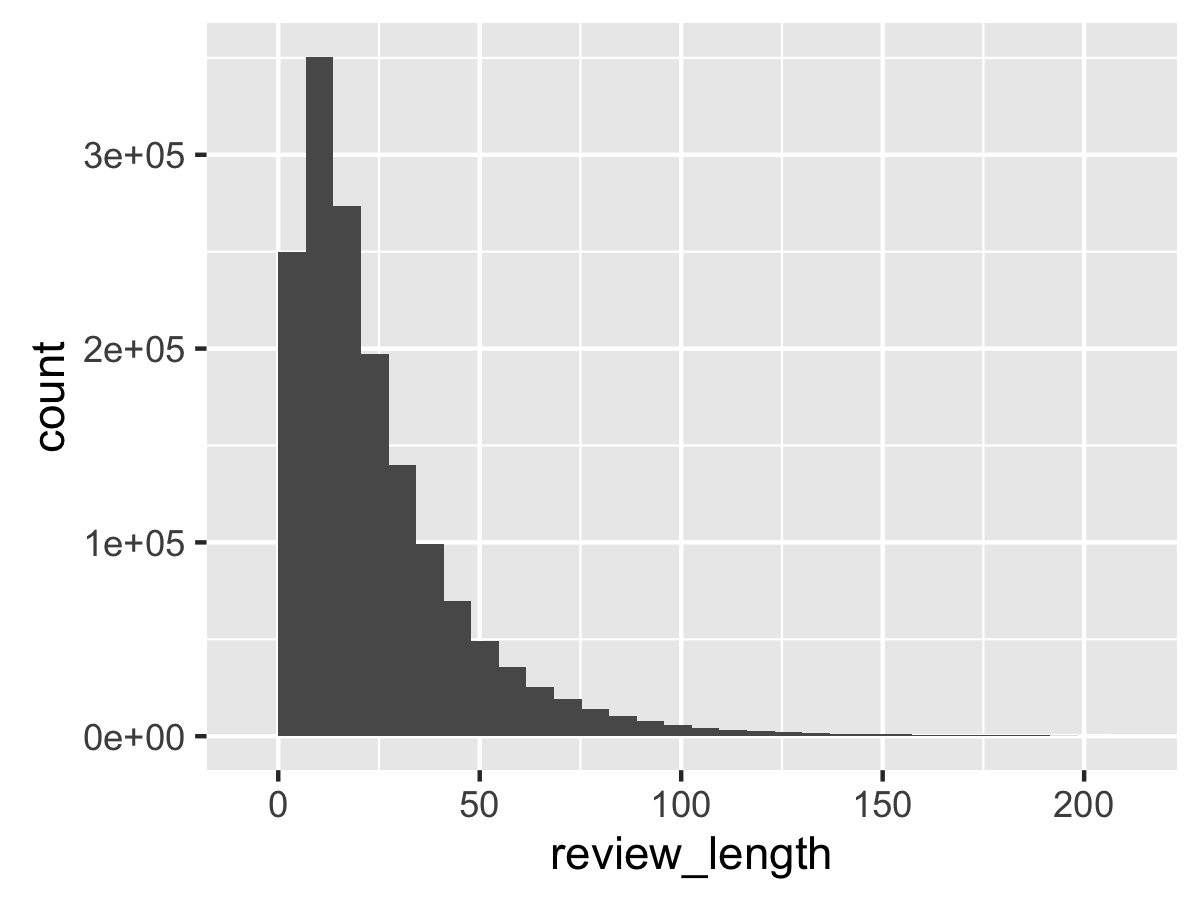
We can do that for other variables too, like review length.
What about bivariate data? If you give two variables to qplot, it will create a scatter plot. Perhaps there is a relationship between the number of stars and the number of positive words?
qplot(data=df_reviews, stars, pos_words)
…and then we run into a problem. In this case, ggplot2 has to plot 1.6M points to screen, which can take awhile, especially if you are simultaneously using your GPU for video recording. Eventually, we get this:
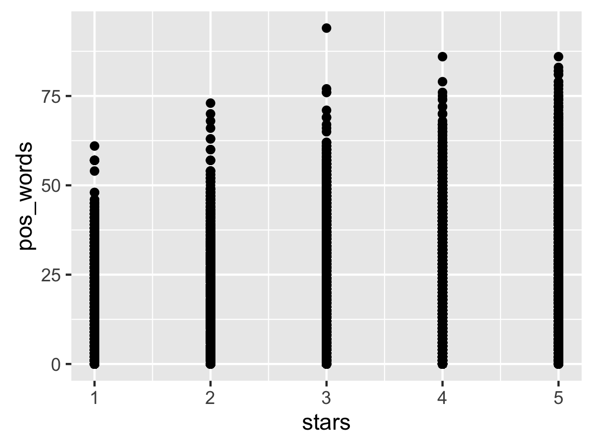
At first glance, there appears to be a positive correlation between star rating and number of positive words, but that’s misleading: since we don’t have alpha transparency on the points, the density is ambiguous. (fixing it requires working outside of a qplot).
Serious Business Data
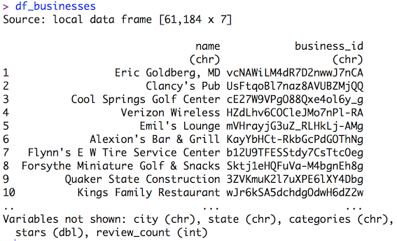
We load the Yelp Businesses data into R through the same way as the reviews data. Here’s an overview of the data:
Both data frames have a business_id column. We can merge them with a left_join, a la SQL. If both data frames have a column with the same name, it will merge on that column by default.
df_reviews <- df_reviews %>% left_join(df_businesses)
Then the R console helpfully points out that both dataframes also have a “stars” column. Uh-oh.
We reset the dfreviews data frame from scratch and merge again, explicitly stating the “by” column for merging. Now we know _where reviews were made, and that might provide helpful information.
Aggregation Station
It might be interesting to know the average star rating by city. dplyr allows for group_by and summarize operations in a similar manner as SQL.
df_cities <- df_reviews %>% group_by(city) %>% summarize(avg_stars = mean(stars.x))
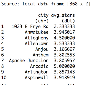
…that’s not good. The original Yelp Dataset Challenge page mentioned that the dataset is only from specific cities, not “1023 E Frye Rd.”
Hmrph.
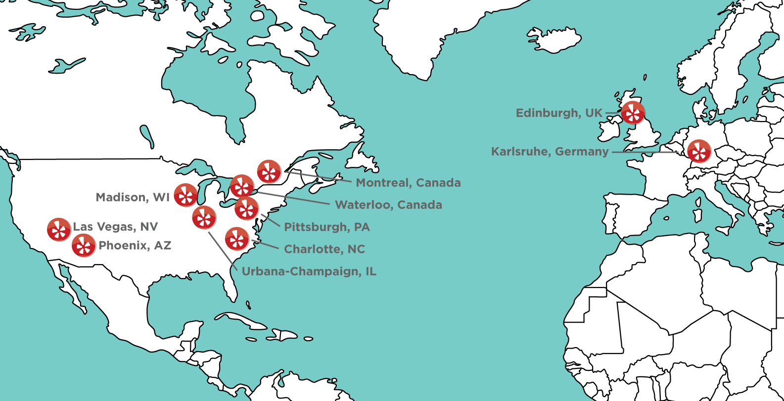
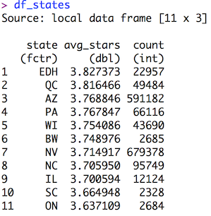
From the map, it appears there is no overlap between any of the cities with geographic states, so let’s use state instead. Additionally, we can add a count of reviews from that state, and sort by that count descending.
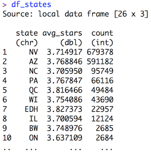
df_states <- df_reviews %>% group_by(state) %>% summarize(avg_stars = mean(stars.x), count=n()) %>% arrange(desc(count))
Looks good enough, but that’s tempting fate.
ggplot All the Things
We can plot state vs. avg_stars with ggplot2. Setting it up is easy:
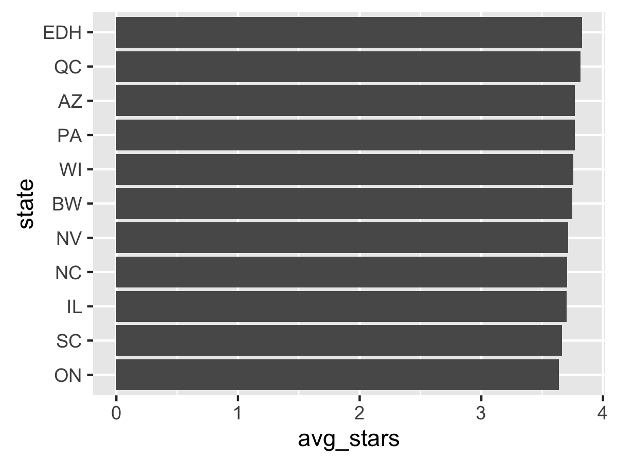
ggplot(data=df_states, aes(state, avg_stars))
The blank plot is actually new to 2.0.0: running the code without any layers would normally throw an error. The axis values appear valid. Let’s add columns via geom_bar:
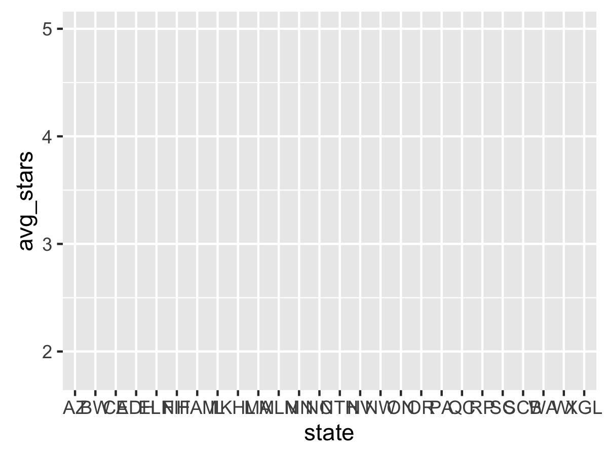
ggplot(data=df_states, aes(state, avg_stars)) + geom_bar()
…and this results in an error. geom_bar by itself does histograms on raw values, as shown in the qplots. The correct fix is to add a stat="identity" parameter to geom_bar, which tells it to scale the bars by the given value of the aesthetic.
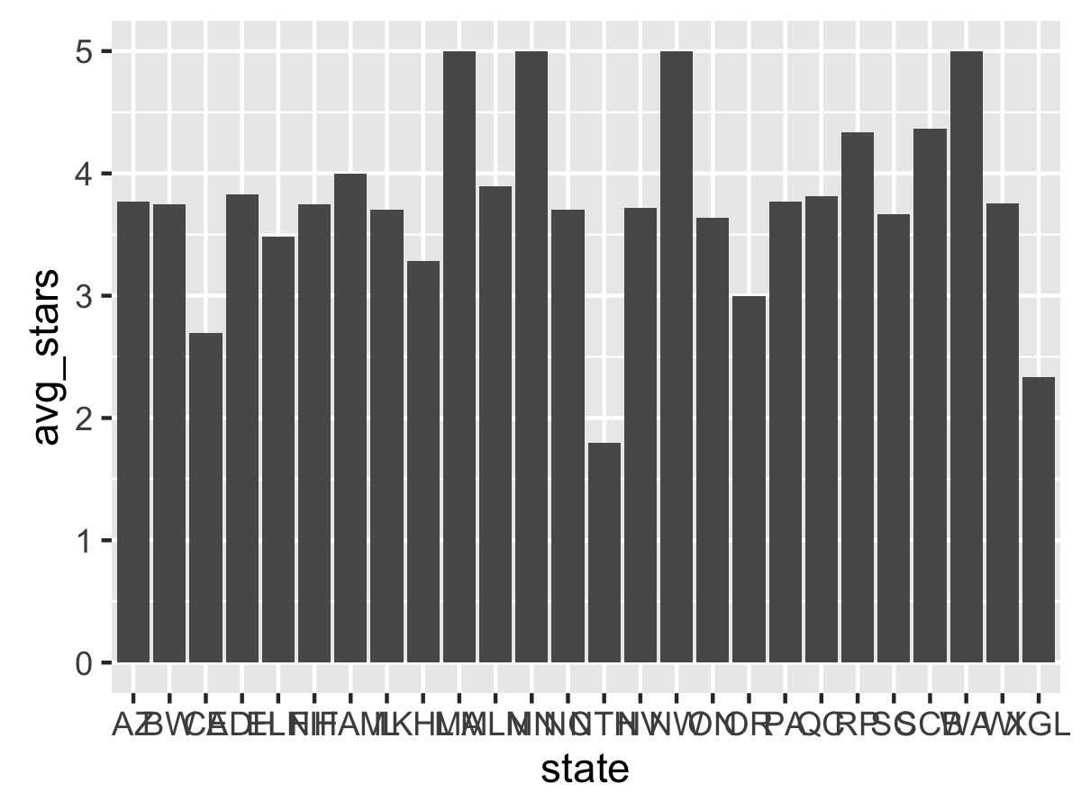
Better. But the x-axis is cluttered and the States would look better on the y-axis. Time for a coord_flip.
Better. Now time to fix the order. You may notice that the order of the states is alphabetical going from the bottom of the axis to the top, and R will always set this order for any character vector. We want the sort the labels by their average star rating, descending. To do that we change the internal factor labels of state volume to the specified order.
In the recording, this took awhile due to several brain farts (which happen often when dealing with factor ordering). First, we need to remove a few states with few reviews using a filter The easiest way to do this is to sort the original data frame by avgstars descending, then set the factor order by using the new state order _in reverse. (Ok, ok, it might be easier to just sort ascending and not reverse, but it makes the overview harder to visualize)
df_states <- df_states %>% arrange(desc(avg_stars)) %>% filter(count > 2000) %>% mutate(state = factor(state, levels=rev(state)))
Rerunning the plot code afterward yields:
Good! Why not add labels for each point? This can be done with geom_text, along with adding hjust=1 to offset the label, changing the size, and setting the text to white. We can round the avg_star values to 2 decimal places as well.
ggplot(data=df_states, aes(state, avg_stars)) + geom_bar(stat="identity") + coord_flip() + geom_text(aes(label=round(avg_stars, 2)), hjust=1, color="white")

The “3.7” label requires using the sprintf function instead of round to print “3.70”, which is not fun. Otherwise, these labels are nice so far. Why not add a theme and axis labels?
I go to my previous ggplot2 tutorial and copy-paste the FiveThirtyEight-inspired theme from there because I am efficient. (The theme required loading the RColorBrewer package, though). The axis labels are added through the labs function. (note that since the axes are flipped, the labels must be flipped too!)
ggplot(data=df_states, aes(state, avg_stars)) + geom_bar(stat="identity") + coord_flip() + geom_text(aes(label=round(avg_stars, 2)), hjust=2, size=2, color="white") + fte_theme() + labs(y="Average Star Rating by State", x="State", title="Average Yelp Review Star Ratings by State")

Why not add 95% confidence intervals for each average? (Note that the normality assumptions for the confidence interval may not be entirely valid). We can calculate the standard error of the mean and rebuild the dataframe and reorder factors again.
df_states <- df_reviews %>% group_by(state) %>% summarize(avg_stars = mean(stars.x), count=n(), se_mean=sd(stars.x)/sqrt(count)) %>% arrange(desc(avg_stars)) %>% filter(count > 2000) %>% mutate(state = factor(state, levels=rev(state)))
Time to add a geom_errorbar (not a geom_crossbar!)
ggplot(data=df_states, aes(state, avg_stars)) + geom_bar(stat="identity") + coord_flip() + geom_text(aes(label=round(avg_stars, 2)), hjust=2, size=2, color="white") + fte_theme() + labs(y="Average Star Rating by State", x="State", title="Average Yelp Review Star Ratings by State") + geom_errorbar(aes(ymin=avg_stars - 1.96 * se_mean, ymax=avg_stars + 1.96 * se_mean))
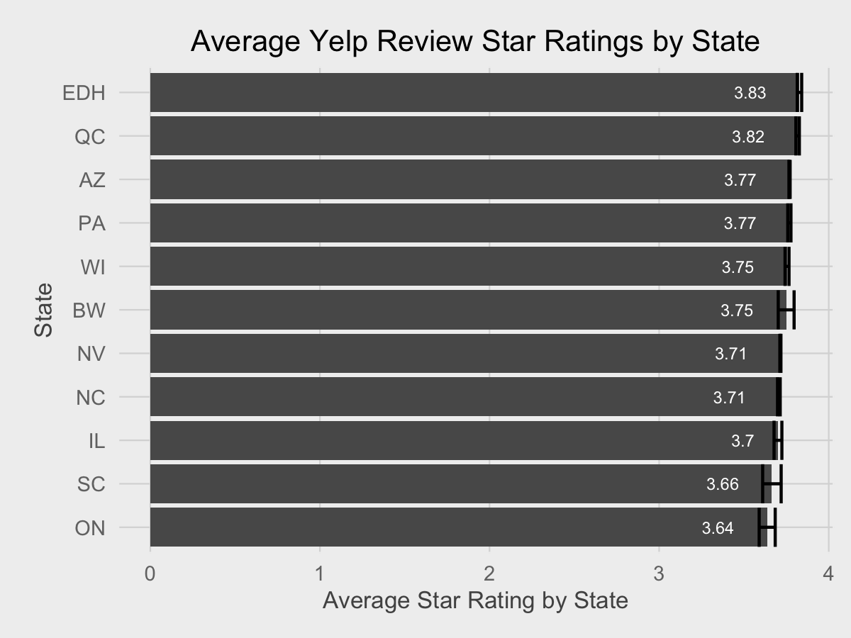
Averages are very stable for all cities due to the large sample size.
At this point I realized the recording is too long and I end it there. For a normal blog post, I’d add more theming, adjust colors so they don’t clash, and add annotations, such as a line representing the true review average from the population. And ideally, performing statistical tests to determine if any averages are different from the population average.
Hopefully this gives some insight into the mechanical process of creating simple data visualizations with R and ggplot2 (the “abridged summary” ended up being as long as a typical blog post!). As my screencast shows, programming is a recurring process of saying “this is easy to do!” then failing miserably for stupid reasons. Even after the 40 minute screencast, there’s still much, much more polish needed for the data visualization. My blog posts take a very long time to produce for those reasons; the clear, clean code from the finished product is not indicative of the unexpected errors that occur when writing it.{% comment %}At the least, they are fixable errors, which is a strong benefit of being a good QA engineer.{% endcomment %}
I did this recording “blind” to test whether or not it’s feasible for me to stream the coding of data visualization on services like Twitch. It’s definitely possible, but has more logistical challenges. (namely, that OBS is fussy outside of Windows and I still need to figure out how to configure it optimally). I admit the code in this screencast may not be the highest-quality code (in retrospect I should have put the code in an editor instead of directly in the console, and reuse dataframe/ggplot objects), but the transparent process for coding data visualizations is important. If there is enough interest, I may revisit Yelp data again, or even more advanced datasets.
You can access the R code used for the data visualizations and the Python scripts used to process the raw Yelp dataset in this GitHub repository. However, the raw data itself cannot be redistributed.
For those wondering what I used for recording the screencast:
Computer: Late 2013 13" Retina MacBook Pro running OS X 10.11.2
Recording Software: Screenflow 4.5
Microphone: Shure MV5 Digital Condenser
Music: Various artists from the “No Attribution Required” section of the YouTube Audio Library