UPDATE August 2017: I have published an updated version of this post with modern trends for making high quality charts with R and ggplot2, which may be a helpful resource in addition to this post.
Readers of my previous blog posts have frequently asked me “how do you make those charts?”
These charts were made using ggplot2, an add-on package for the R programming language, along with lots of iterative improvement over the months. R notably has chart-making capabilities built into the language by default, but it is not easy to use and often produces very simplistic charts. Enter ggplot2, which allows users to create full-featured and robust charts with only a few lines of code.
You’ve probably seen charts elsewhere on the internet similar to this one. While it implements the “Grammar of Graphics” (which is where the “gg” in “ggplot2” comes from), it does look generic and cluttered.
Adding a touch of color and design can help make more compelling visualizations, and it’s pretty easy to do thanks to ggplot2’s syntax and chaining capabilities.
Quick Design Notes
Charts with a completely-gray background have become rather popular lately, mostly in part to the charts produced by FiveThirtyEight, which was the inspiration behind my design. An important functional aspect of a gray background is that it makes the chart area distinct from the article body.
The charts I make are typically 1200px by 900px. On my blog, the width of the article text container is less than 1200px, so the browser shrinks the chart to make it fit. The chart still appears at a high resolution on HiDPI/Retina screens, and since the charts are simple, shrinking will not cause significant graphical distortion on normal-resolution screens. 1200x900px also keeps the file size low, which is important when putting 10 or more charts in a post.
An important tip when making charts in ggplot2: render the chart on OS X, if possible. OS X has antialiasing for text and curves in charts, while Windows/Linux does not, and it can significantly improve the quality of the chart.
Making a ggplot2 Histogram
The first chart we’ll be making is a histogram. This is a good example of a chart that’s easy to make in R/ggplot2, but hard to make Excel.
For this tutorial, we’ll be using ggplot2, plus three additional R packages: RColorBrewer, which allows for the procedural generation of colors from a palette for the chart, scales, which allows for the axes to express numbers with commas/percents, and grid, which allows for manipulation of the chart margins and layout. We can install and load these packages at the beginning of the R file:
install.packages(c("ggplot2","RColorBrewer","scales"))
library(ggplot2); library(scales); library(grid); library(RColorBrewer)
The dataset we’ll use is my list of 15,101 BuzzFeed listicles that I used in my previous blog post, including both the listicle size and number of Facebook shares the listicle received, which have been prefiltered to listicle sizes of 50 or less, and have received atleast 1 Facebook share. Download the file, and set the working directory of R to the containing folder. We load the dataset into R by reading the CSV:
df <- read.csv("buzzfeed_linkbait_headlines.csv", header=T)
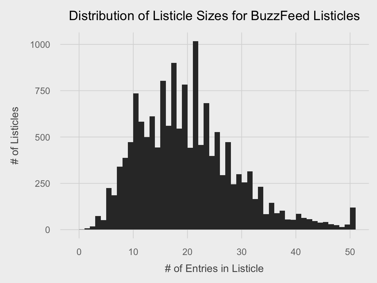
We can make a basic histogram in two lines of code.
ggplot(df, aes(listicle_size)) +
	geom_histogram(binwidth=1)
The first line instantiates the charts and defines the variables used for plotting. We declare the use of the data frame df, and the listicle_size vector from that data frame as the plotting aesthetic. The second line tells ggplot to make a histogram out of the given data with geom_histogram, and we specify a binwidth of 1 so that each column represents one discrete value of listicle. Running that code will cause a plot to pop up.
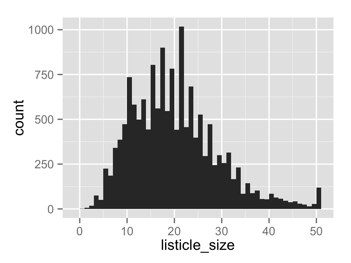
Not a bad start. In order to save the created plot, we use the ggsave command, which saves the last-generated plot to an image in your working directory. The first parameter, the filename, determines the filetype.
ggsave("tutorial_1.png", dpi=300, width=4, height=3)
Now we can add a theme to make it look classy.
A ggplot2 theme is a function that overrides the graphical parameters of the default theme. Here’s the long code block for my FiveThirtyEight-inspired theme, with code comments for each code subblock:
fte_theme <- function() {

# Generate the colors for the chart procedurally with RColorBrewer
palette <- brewer.pal("Greys", n=9)
color.background = palette[2]
color.grid.major = palette[3]
color.axis.text = palette[6]
color.axis.title = palette[7]
color.title = palette[9]

# Begin construction of chart
theme_bw(base_size=9) +

# Set the entire chart region to a light gray color
theme(panel.background=element_rect(fill=color.background, color=color.background)) +
theme(plot.background=element_rect(fill=color.background, color=color.background)) +
theme(panel.border=element_rect(color=color.background)) +

# Format the grid
theme(panel.grid.major=element_line(color=color.grid.major,size=.25)) +
theme(panel.grid.minor=element_blank()) +
theme(axis.ticks=element_blank()) +

# Format the legend, but hide by default
theme(legend.position="none") +
theme(legend.background = element_rect(fill=color.background)) +
theme(legend.text = element_text(size=7,color=color.axis.title)) +

# Set title and axis labels, and format these and tick marks
theme(plot.title=element_text(color=color.title, size=10, vjust=1.25)) +
theme(axis.text.x=element_text(size=7,color=color.axis.text)) +
theme(axis.text.y=element_text(size=7,color=color.axis.text)) +
theme(axis.title.x=element_text(size=8,color=color.axis.title, vjust=0)) +
theme(axis.title.y=element_text(size=8,color=color.axis.title, vjust=1.25)) +

# Plot margins
theme(plot.margin = unit(c(0.35, 0.2, 0.3, 0.35), "cm"))
}
Adding the completed theme to the chart is just one line of code:
ggplot(df, aes(listicle_size)) +
	geom_histogram(binwidth=1) +
	fte_theme()
A little more classy. Now that the core design of the chart is present, we can make polish the chart to make it more beautiful.
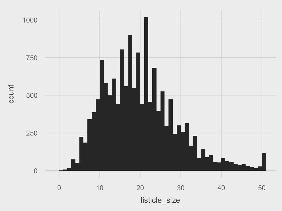
Of course, all charts need properly labled axes and a title. We can add that with the labs function:
ggplot(df, aes(listicle_size)) +
	geom_histogram(binwidth=1) +
	fte_theme() +
labs(title="Distribution of Listicle Sizes for BuzzFeed Listicles", x="# of Entries in Listicle", y="# of Listicles")
Now we can add a few finishing touches. For the x-axis, we can set the breaks to 5 instead of 10 using scale_x_continuous since we have the room. For the y-axis, since we have an axis value with 4 digits, we can set the formatting to use a comma with scale_y_continuous. Lastly, we can add a line at y = 0 using geom_line to further seperate the data. Lastly, in geom_histogram, we can change the fill of the bars to a red color for more thematic branding, and also reduce the opacity to make the grid lines visible behind the chart.
Putting it all together:
ggplot(df, aes(listicle_size)) +
 	geom_histogram(binwidth=1, fill="#c0392b", alpha=0.75) +
	fte_theme() +
	labs(title="Distribution of Listicle Sizes for BuzzFeed Listicles", x="# of Entries in Listicle", y="# of Listicles") +
	scale_x_continuous(breaks=seq(0,50, by=5)) +
	scale_y_continuous(labels=comma) +
	geom_hline(yintercept=0, size=0.4, color="black")
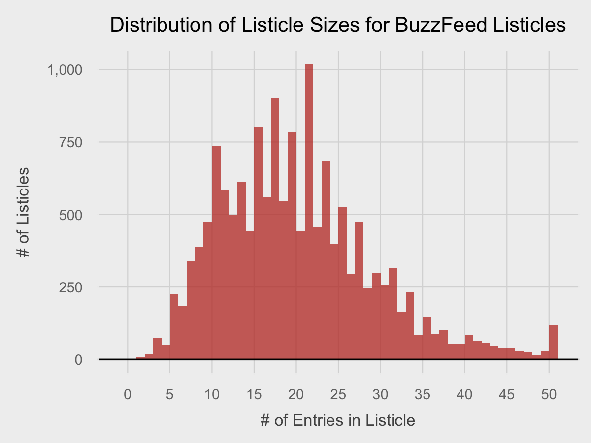
That’s pretty professional and is a good stopping point. Normally, I would change the text fonts as well, but that’s a subject for another post.
Making a ggplot2 Scatterplot
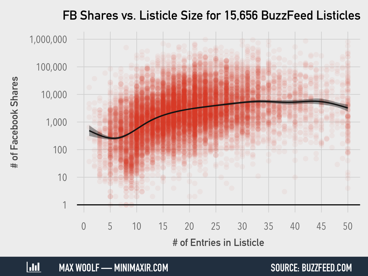
Scatterplots are also efficient to do in ggplot2, which especially useful as making a plot containing 15,101 points might cause spreadsheets to freeze.
Creating a scatterplot of the relationship between listicle size and the number of Facebook shares the listicle receives is essentially the same procedure as creating a histogram, except that the x-axis and y-axis aesthetic vectors must be declared explicitly.
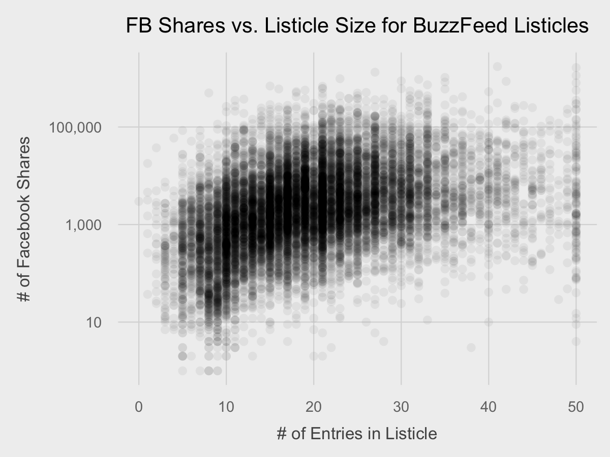
ggplot(df, aes(x=listicle_size, y=num_fb_shares)) +
	geom_point()
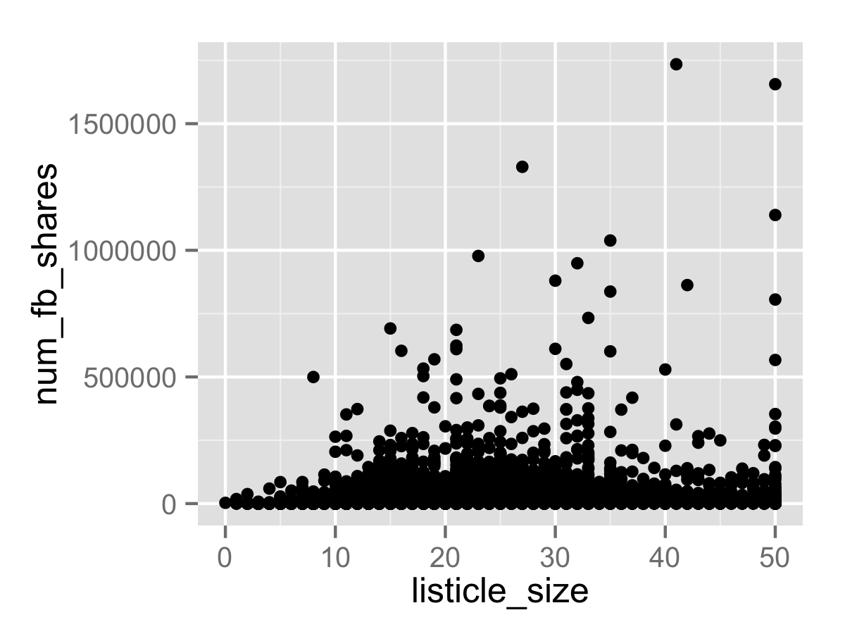
Because there are a few listicles with over 1 million Facebook shares (welcome to 2015), the entire plot is skewed. As a result, we need to compress the plot by scaling the y-axis logarithmically using scale_y_log10. Additionally, there will be a large amount of overlap between points due to the large sample size, so we need to greatly reduce the opacity of the points. (I set to 5% for this chart, but the best value can be determined through trial and error)
ggplot(df, aes(x=listicle_size, y=num_fb_shares)) +
	geom_point(alpha=0.05) +
	scale_y_log10(labels=comma)
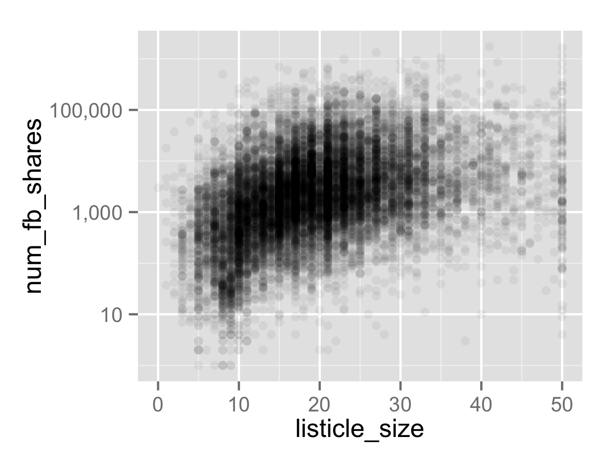
That’s a lot more intuitive, and it makes it clear that there is indeed a positive relationship between listicle size and the number of Facebook shares.
Now we can apply the theme and labels:
ggplot(df, aes(x=listicle_size, y=num_fb_shares)) +
	geom_point(alpha=0.05) +
	scale_y_log10(labels=comma) +
	fte_theme() +
	labs(x="# of Entries in Listicle", y="# of Facebook Shares", title="FB Shares vs. Listicle Size for BuzzFeed Listicles")
And then the final touches. We can include the same horizontal line, x-axis behavior, and point color as with the last plot. However, for the y-axis, we have room to include each power of 10 between 1 and 1,000,000 as breaks, which we can do through a cute R syntax trick: 10^(0:6). While the chart shows a positive relationship between the variables, the shape is ambiguous and it may be helpful to add a trend line. We use geom_smooth to add a trendline representing a generalized additive model with a 95% confidence interval.
Putting it all together:
ggplot(df, aes(x=listicle_size, y=num_fb_shares)) +
	geom_point(alpha=0.05, color="#c0392b") +
	scale_x_continuous(breaks=seq(0,50, by=5)) +
	scale_y_log10(labels=comma, breaks=10^(0:6)) +
	geom_hline(yintercept=1, size=0.4, color="black") +
	geom_smooth(alpha=0.25, color="black", fill="black") +
	fte_theme() +
	labs(x="# of Entries in Listicle", y="# of Facebook Shares", title="FB Shares vs. Listicle Size for BuzzFeed Listicles")
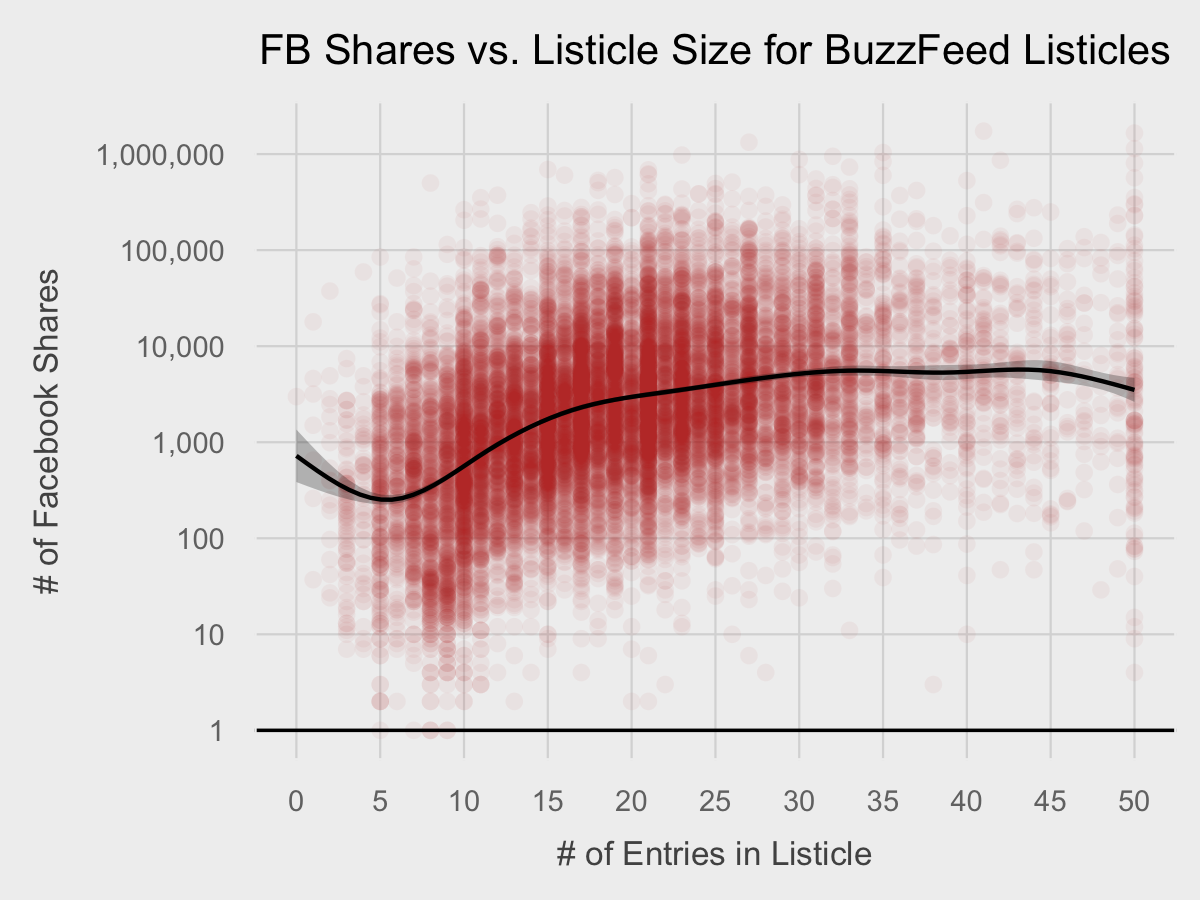
Now that is pretty insightful.
Hopefully, this small overview of how ggplot2 gives you an small idea of what it can do. This is just the tip of the iceberg. However, making cooler charts such as categorical bar charts, charts with multiple factor variables, and charts with multiple facets require smart data preprocessing, which is a topic for another blog post.
You can access a copy of the code used in this blog post at this GitHub repository.