A few months ago, I had posted a visualization of NYC Yellow Taxis using ggplot2, an extremely-popular R package by Hadley Wickham for data visualization. At the time, the code used for the chart was very messy since I was eager to create something cool after seeing the referenced Hacker News thread. Due to popular demand, I’ve cleaned up the code and have released it open source, with a few improvements.
Here are some tips and tutorials on how to make such visualizations.
Getting the Data
As usual, a Jupyter notebook containing the code and visualizations used in this article is available open-source on GitHub.
A quick summary of the previous post: I obtained the data from BigQuery, which was uploaded from the official NYC Taxi & Limousine Commission datasets, plotted each taxi point as a tiny white dot on a fully-black map, and colorized the dots depending on the number of taxis at that location.
In September, the BigQuery dataset was updated to include all data from January 2009 to June 2015: over 1.1 billion Yellow Taxi rides recorded. Here’s an updated query, which additionally calculates the total non-tip revenue for a given location, since that might be useful later, and implements a sanity check filter noted by Felipe Hoffa.
SELECT ROUND(pickup_latitude, 4) AS lat,
ROUND(pickup_longitude, 4) AS long,
COUNT(*) AS num_pickups,
SUM(fare_amount) AS total_revenue
FROM [nyc-tlc:yellow.trips]
WHERE fare_amount/trip_distance BETWEEN 2 AND 10
GROUP BY lat, long
The resulting dataset is 4 million rows and 116MB in size! This is well over the limit for downloading from the web BigQuery client, so you must use a local client (in the attached notebook, R), and it will still take about 10-15 minutes to download (as a result, I recommend caching the results locally). Relatedly, rendering 4 million points on a single plot on screen may be computationally intensive: I strongly recommend rendering the visualization to disk by instantiating a png device or by using ggsave.
Here’s a few results from that query.
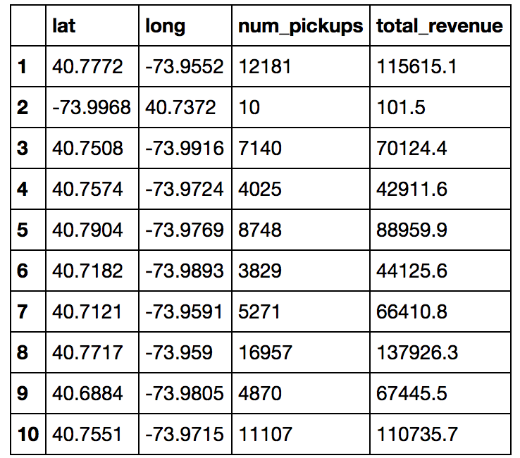
As you can see, the second latitude/longitude combo is blatantly wrong. This isn’t the first fidelity issue with the dataset, but we will address those in due time.
Plotting the Taxis
Let’s do a basic ggplot2 plot to test things out. All we need to do is plot a small point for every lat/long combination, and then save the resulting plot.
plot <- ggplot(df, aes(x=long, y=lat)) +
            geom_point(size=0.06) +

png("nyc-taxi-1.png", w=600, h=600)
plot
dev.off()
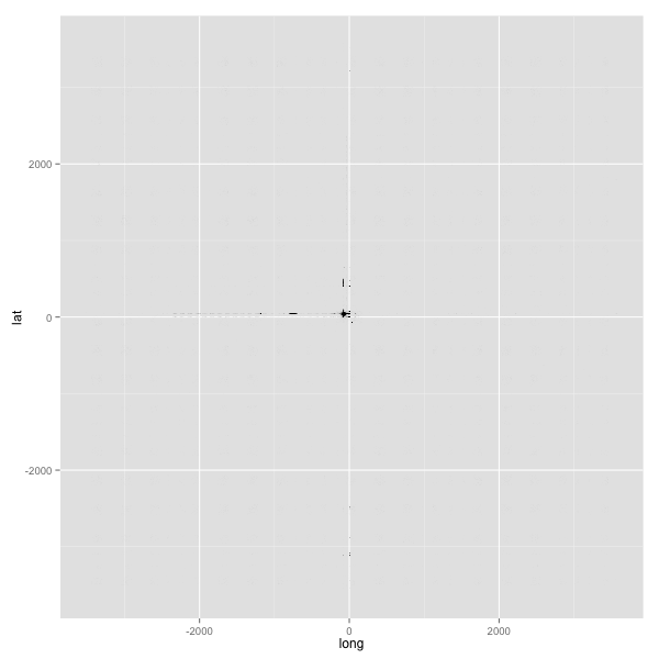
…stupid data fidelity issues.
This issue is fixed by constraining the plot to a bounding box of latitude and longitude coordinates corresponding to NYC. Flickr has a good starting point for a NYC bounding box; I took that and edited the limits more precisely using the Bounding Box Tool.
min_lat <- 40.5774
max_lat <- 40.9176
min_long <- -74.15
max_long <- -73.7004
You could also enforce the bounding box during the BigQuery. Now let’s implement the bounding box in the plot:
plot <- ggplot(df, aes(x=long, y=lat)) +
            geom_point(size=0.06) +
            scale_x_continuous(limits=c(min_long, max_long)) +
            scale_y_continuous(limits=c(min_lat, max_lat))

png("nyc-taxi-2.png", w=600, h=600)
plot
dev.off()
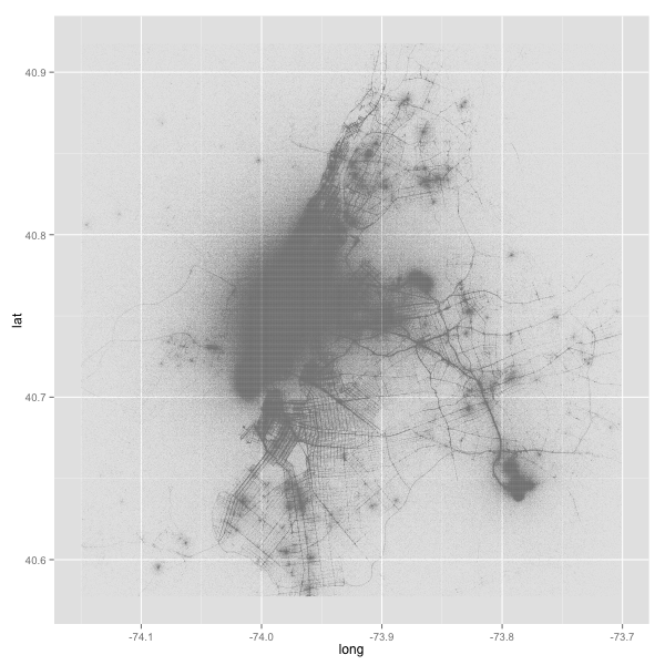
Much, much better! Now that the visualization generally looks like what we want it to be, we can start theming.
Let’s start small and do just a few tweaks:
- Filter the data slightly to reduce some erroneous points.
- The theme must be primarily a black background, with most of the ggplot2 theme attributes stripped out and the margins nullified. (implemented as
theme_map_dark(); code is in the notebook) - Set the resolution of the rendering device to 300 DPI; this reduces some of the aliasing in the resulting image.
plot <- ggplot(df %>% filter(num_pickups > 10), aes(x=long, y=lat)) +
            geom_point(color="white", size=0.06) +
            scale_x_continuous(limits=c(min_long, max_long)) +
            scale_y_continuous(limits=c(min_lat, max_lat)) +
            theme_map_dark()

png("nyc-taxi-3.png", w=600, h=600, res=300)
plot
dev.off()
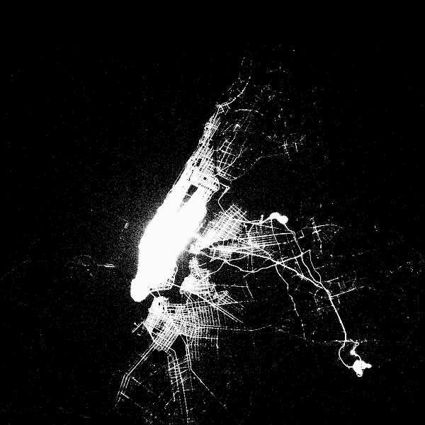
Right on track! Now time to make things more professional.
This requires the implementation of a few more aesthetics:
- Add a gradient color based on intensity of the number of pickups: since the number of pickups will logically be near streets, the coloring will be more intense near streets. Exact color doesn’t matter; I used the purple Wisteria from Flat UI Colors to represent maximum intensity. Additionally, the scale should be logarithmic to make the colors stand out. (Another approach is to scale the transparency of the points instead, which is the approach Brian Lance had done and that works well too)
- Annotate the theme with a proper title (and remove the scale legend; since the exact values on specific points will not be helpful)
- Force the plot to obey the dimension ratio with
coord_equal(), otherwise the map will stretch and distort to fill the entirety of the plotting area. (you can see a vertical stretch effect with the previous image)
Putting it all together:
plot <- ggplot(df %>% filter(num_pickups > 10), aes(x=long, y=lat, color=num_pickups)) +
            geom_point(size=0.06) +
            scale_x_continuous(limits=c(min_long, max_long)) +
            scale_y_continuous(limits=c(min_lat, max_lat)) +
            theme_map_dark() +
            scale_color_gradient(low="#CCCCCC", high="#8E44AD", trans="log") +
            labs(title = "Map of NYC, Plotted Using Locations Of All Yellow Taxi Pickups") +
            theme(legend.position="none") +
            coord_equal()

png("nyc-taxi-4.png", w=600, h=600, res=300)
plot
dev.off()
results in this image, which is what we want! However there is a slight problem, and I will wrap the image in a red border to demonstrate.
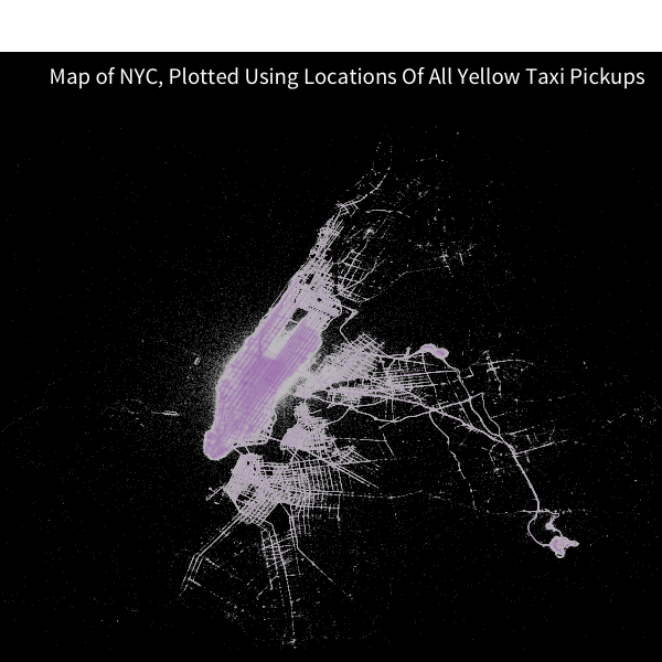
Due to coord_equal() enforcing the chart dimensions, the rendering device has a gap of white space at the top due to interaction with the grid graphics package that ggplot2 is based upon; normally not a problem for default charts, but a waste of space for visualizations with non-white backgrounds.
I attempted to fix this issue by forcing grid to render a black rectangle then plot on top of it. Unfornately, that was not successful. The quickest workaround is to set the image dimensions through trial-and-error such that the issue is minimized.
All things considered, that’s minor but should still be noted. The streets of Manhattan are visible! And there’s still more that can be done.
Hexing the Revenue
Hex map overlays are a popular technique for aggregating two-dimensional data on a 3rd dimension. ggplot2 has a relatively new stat_summary_hex function which does just that.
Why not aggregate total revenue for NYC Yellow Taxi Pickups to determine where taxis generate the most money? Since we conveniently have the code to generate a map of NYC already, we can plot the hex bins on top of that map, after a few more tweaks:
- Set the 3rd dimension,
z, tototal_revenue - Set the aggregation to the
sumfunction, so it sums up all the revenues within a bin. - Scale the total hex revenues with a gradient.
- Tweak all the aesthetics: color of the base points, the color of the hexes, the transparency of the hexes, and the name of the chart.
- Set the chart dimensions to avoid the
coord_equal()issue mention above.
plot <- ggplot(df %>% filter(num_pickups > 20), aes(x=long, y=lat, z=total_revenue)) +
            geom_point(size=0.06, color="#999999") +
            stat_summary_hex(fun = sum, bins=100, alpha=0.7) +
            scale_x_continuous(limits=c(min_long, max_long)) +
            scale_y_continuous(limits=c(min_lat, max_lat)) +
            theme_map_dark() +
            scale_fill_gradient(low="#CCCCCC", high="#27AE60", labels=dollar) +
            labs(title = "Total Revenue for NYC Yellow Taxis by Pickup Location, from Jan 2009 ― June 2015") +
            coord_equal()

png("nyc-taxi-5.png", w=950, h=860, res=300)
plot
dev.off()
That wasn’t too bad. The gradient shows that Penn Station in Manhattan, along with the two airports, are the largest revenue generators.
I posted the hex-overlayed map on Reddit to /r/dataisbeautiful as a part of my data visualization beta-testing. Although the chart received just under 200 upvotes, the comments in the Reddit thread were unanimously negative. Reddit user /u/DanHeidel posted a long rant on the problems with the aesthetics of the chart. And for the most part, I agree with his assessment.
Let’s try again, and address the claims made in the Reddit comments.
- Only show hex bins where there is enough valid data, which should remove the mysterious hexes over the water. This can be implemented through a helper aggregate function which does not render the hex if the total revenue of the hex is under some threshold value. (I set it to $100,000)
- Scale the total hex revenue logarithmically, and change the color to a Red hue (Alizarin) to make the step values more visible.
- Zoom the chart dimensions closer to Manhattan.
- Make a few more aesthetic tweaks.
Here’s take two:
total_rev <- function(x, threshold = 10^5) {
    if (sum(x) < threshold) {return (NA)}
    else {return (sum(x))}
}

plot <- ggplot(df %>% filter(num_pickups > 10), aes(x=long, y=lat, z=total_revenue)) +
            geom_point(size=0.06, color="#999999") +
            stat_summary_hex(fun = total_rev, bins=100, alpha=0.5) +
            scale_x_continuous(limits=c(-74.0224, -73.8521)) +
            scale_y_continuous(limits=c(40.6959, 40.8348)) +
            theme_map_dark() +
            scale_fill_gradient(low="#FFFFFF", high="#E74C3C", labels=dollar, trans="log", breaks=c(10^(6:8))) +
            labs(title = "Total Revenue for NYC Yellow Taxis by Pickup Location, from Jan 2009 ― June 2015") +
            coord_equal()

png("nyc-taxi-6.png", w=900, h=900, res=300)
plot
dev.off()
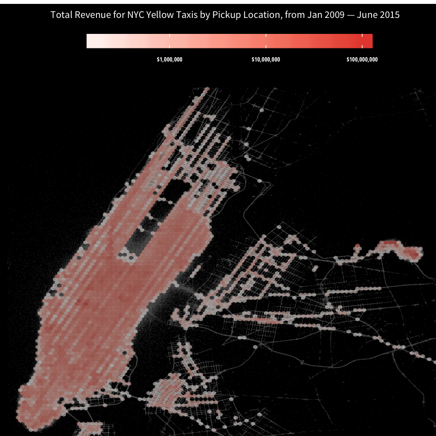
A good step forward. Revenue all through Manhattan is mostly the same except for Penn Station. Meanwhile, the hexes in LaGuardia Airport are noticeably more saturated than Penn Station.
Hopefully, this tutorial gave you a good look into a few interesting tricks that can be accomplished with ggplot2, even though the code can be somewhat messy. If you want more orthodox methods of plotting geographic data in ggplot2, you should look into the ggmap R package, which I used to plot Facebook Checkin data in San Francisco, and look into the maps R package plus shape files, which I used to plot Instagram photo location data. Unfortunately, the code may not necessarily be less messy.
If you use the code or data visualization designs contained within this article, it would be greatly appreciated if proper attribution is given back to this article and/or myself. Thanks!