Generating Distinct AI Voice Performances By Prompt Engineering GPT-4o
“You are an expert voice actor specializing in silly voices.”
“You are an expert voice actor specializing in silly voices.”
.](/2024/08/ai-seinfeld/uncanny_valley_0.webp)
What’s the deal with the uncanny valley?

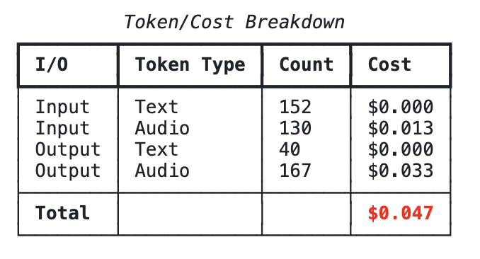
Including OpenAI’s other text generating AI!
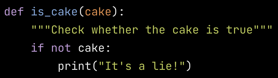
At the least, AI-generated code is much more readable than the average human’s.
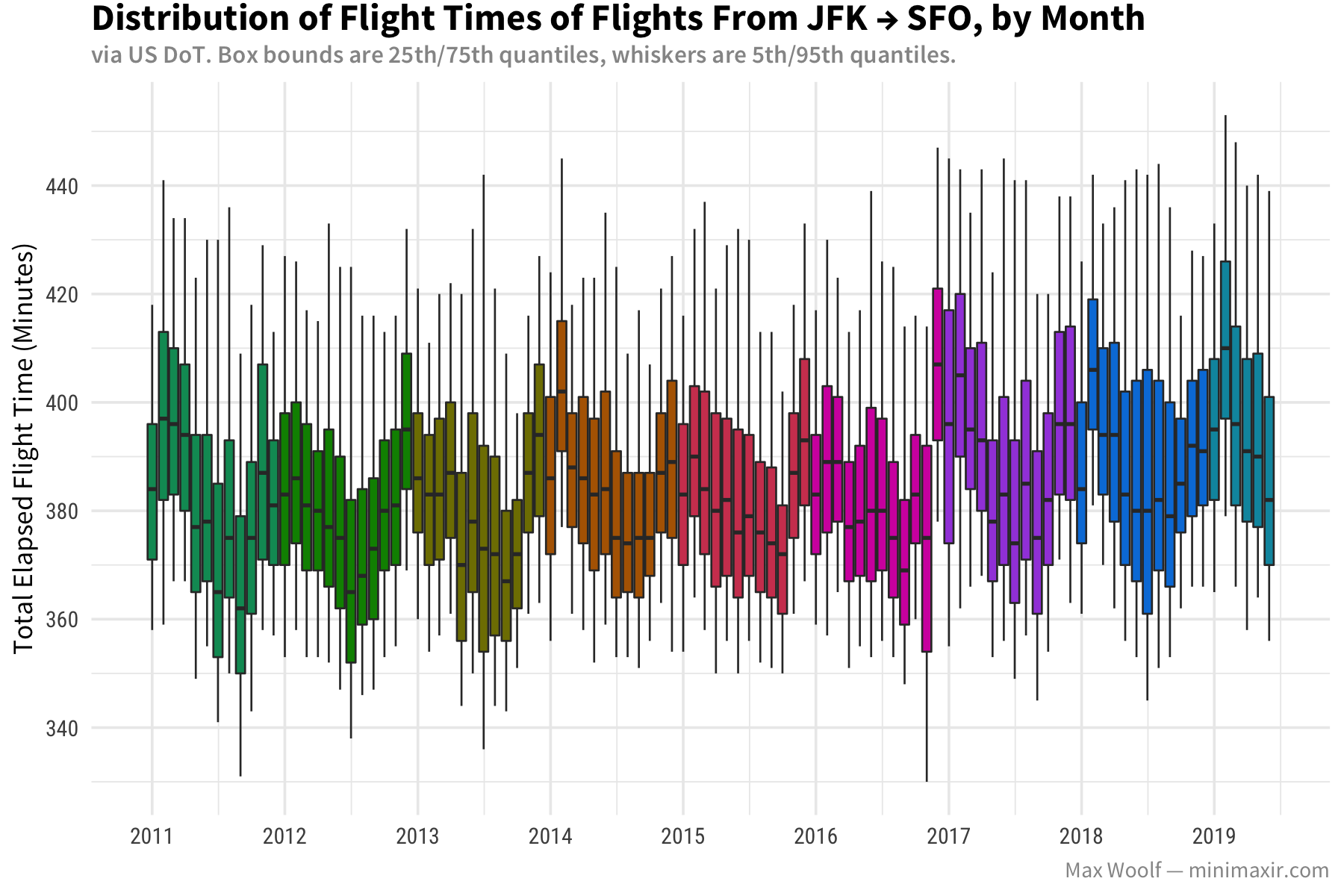
Box plots, when used correctly, can be a very fun way to visualize big data.