Experiments with Making Convincing AI-Generated Fake News
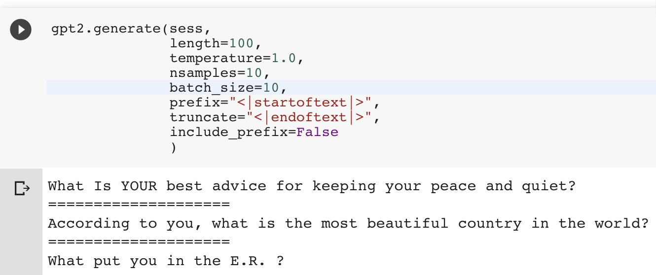
Can the CTRL model create the “fake news” OpenAI was concerned about? Let’s put it to the test.
Can the CTRL model create the “fake news” OpenAI was concerned about? Let’s put it to the test.
Thanks to gpt-2-simple and this Colaboratory Notebook, you can easily finetune GPT-2 on your own dataset!
MOOCs and thought pieces overfit to a certain style of data science that is not robust to the vast uncertainties of the real world.
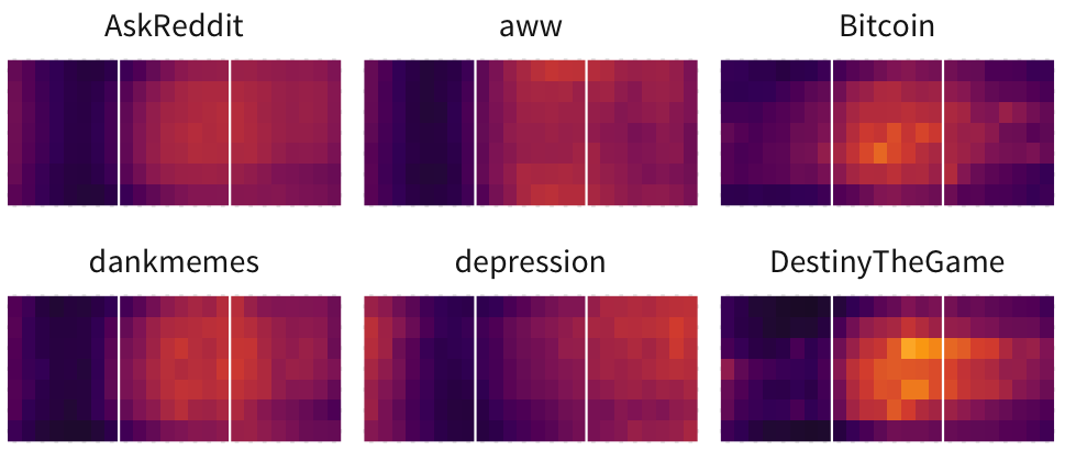
The nature of algorithmic feeds like Reddit inherently leads to a survivorship bias: although users may recognize certain types of posts that appear on the front page, there are many more which follow the same patterns but fail.
For IMDb’s big-but-not-big data, you have to play with the data smartly, and both R and ggplot2 have neat tricks to do just that.