At the end of May, Harvard and MIT jointly released a dataset containing statistics about their online courses in the Academic Year of 2013. This Person-Course De-Identified dataset contains 476,532 students who have taken up to 13 unique courses from a variety of topics:
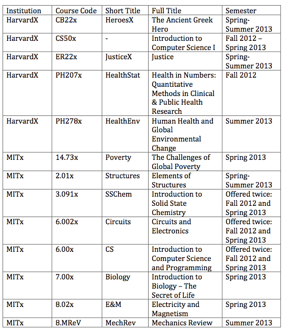
About half of the courses involve subjects in the humanities, while the other half involve computer science and electrical engineering.
One of the statistics I wanted to analyze was the gender ratio of students of online courses. In the data set, 425,105 students have a gender on record, with 311,534 male students (73.3%) and 113,571 female students (26.7%). This population proportion of female students is surprisingly low, especially since the male/female ratio is about 50:50 at MIT and Harvard themselves.
Therefore, I took a looked at the gender distribution of each of the 13 unique courses. Is the gender ratio similar across all classes, or is there a huge difference between classes?
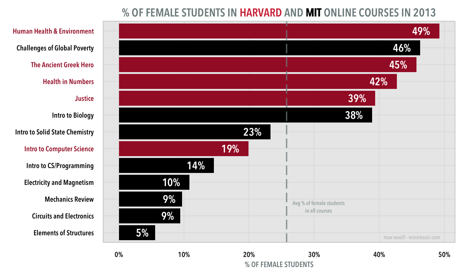
Yeah, there’s a huge difference.
The proportion of female students in each of Harvard and MIT’s online courses range from 5% to 49%.
The top half of the gender ratios are all well above the 26.7% threshold. All six of these courses are in the humanities or in the life sciences. The bottom half of the gender ratio are all well below the 26.7% threshold. All seven are these courses are engineering or computer science courses with a strong focus on mathematics. (for clarification, the Elements of Structures course at MIT is a physics course with linear algebra programming)
Is there a correlation? As it turns out, the reason that the average proportion of female students is so low is that both Harvard’s Introduction to Computer Science I (where 169,621 students took the class; about 40% of all students) and MIT’s Introduction to CS/Programming (124,446 students total across both semesters) are so popular that the low percentage of women in those particular classes is drastically affecting the average.
The presence and interest of women in STEM fields (science, technology, engineering, and mathematics) has been a topic of controversy for a very long time. However, the chart shows that indeed the percentage of women interested in STEM classes is measurably lower than other fields, and hopefully awareness of this issue will help cause changes in the future.
- Data was processed using R and the chart was made using ggplot2. (w/ a few annotations added using a photo editor)
- You can view code necessary to reproduce these results in this GitHub repository. Since MIT/Harvard prevent redistribution of the dataset, you’ll have to download the dataset yourself.