You’ve probably seen word clouds around the internet. There are several popular free tools for creating them, such as Wordle. I myself am a fan of them, and I have made them for previous posts using the wordcloud package for R.
Word clouds are not the most scientific type of data visualization. However, they are a very information-dense representation of the frequency of all words in a given text. Word clouds are more effective than just using bar charts displaying the counts of words for large amounts of text, as the chart would be difficult to parse if there are too many bars.
The Python word_cloud package by Andreas Mueller is relatively popular. A Reddit bot makeswordclouds by Jesse Bryan automatically generates a word cloud of comments on Reddit submissions using this package. However, when I first saw the example output on the package, I was not impressed.
I did more research into the package documentation. I found that there are two important perks present the Python implementation:
- Python word_cloud allows the user to specify a mask to constrain the distribution of words.
- In addition to the mask, Python word_cloud allows the user to use the original colors of the image to set the colors of the words.
The masks are the more interesting aspect for creating visualizations, but where do you get the masks? You can manually trace and extract objects from images, but that can be time consuming and the masks will likely be heavily aliased and at a low resolution (the size of the mask sets the size of the word cloud).
Enter Font Awesome, an icon font by Dave Gandy which is very widely used throughout the Internet (including this website). Icon fonts contain a wide variety of shapes and are vectorized, and therefore they can scale to any size.
So why not use Font Awesome icons as masks for the word cloud? The font icons need to be extracted and rasterized as an image in order to be usable with the Python word_cloud package: cue the Python script Icon Font to PNG by Pythonity which does what the name implies.
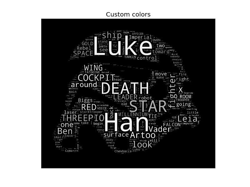
Now every Font Awesome icon can be used as a word cloud mask! And the icons can be exported at any size: for this post, I render the word clouds at 2048x2048px, larger than most desktop screens! After hacking the Python scripts included with the package which were used to create the default word clouds, I managed to create a few interesting examples.
Reddit Data and Thematic Icons
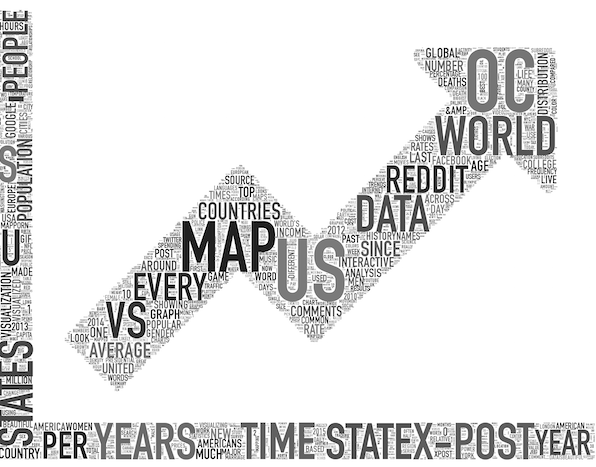
Font Awesome has icons for charts, which logically appeals to me as a data person. Why not make a word cloud which looks like a line chart?
Let’s use the word counts of titles of submissions to the /r/dataisbeautiful subreddit on Reddit which have scored at least 100 points (using the Reddit data dump located on BigQuery).
Additionally, we can improve on the design of the default word cloud output by forcing all-caps text and by changing the text font. For word clouds, I prefer to use condensed font families, as they can allow for more information to be displayed in the word cloud. In this example, I will be using the DIN Condensed font, a font native to OS X and a font you’ve likely seen in media advertisements and website logos.
Putting it all together:
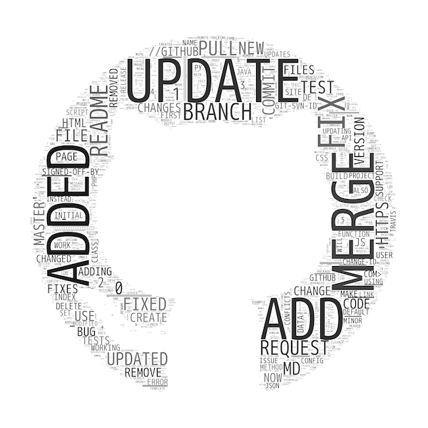
GitHub Data and Brand Icons
Font Awesome also contains icons representing the logos of popular internet brands, such as Facebook and Twitter.
GitHub is another such website. I will use BigQuery again with the 2014 GitHub Archive dataset to gather word counts of git commit messages during that year, and use the modern GitHub logo as the mask. This time, I will incorporate the freeware condensed monospaced font M+ 1m in order to create a more code-like aesthetic, which creates an interesting look when juxtaposed with the negative space of GitHub’s logo.
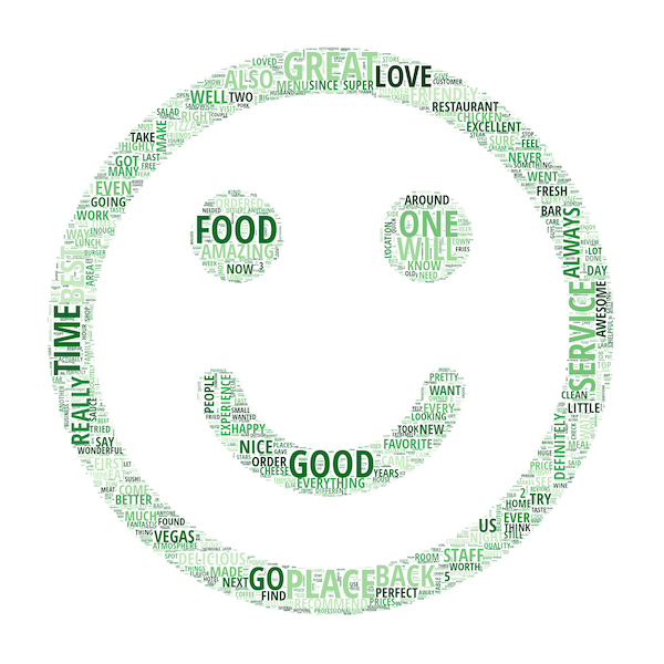
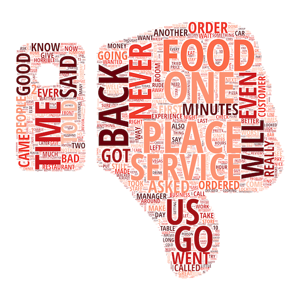
Yelp Data and Sentiment Icons
One of the earliest word clouds I made was for the Yelp reviews dataset from the Yelp Dataset Challenge to compare and contrast verbiage between 1-star reviews and 5-star reviews. Let’s remake those word clouds.
At this point I should mention appropriate color palettes for word clouds since the rainbows of the stereotypical word clouds can be distracting. I strongly recommend using the ColorBrewer palettes, helpfully provided for this use case with the paletteable Python library by Matt Davis. I particularly like the sequential palettes, which follow a clean gradient between white and another color (or between two or three colors), although I ignore some of the lighter colors as they may not be visible against white backgrounds.
The font choice this time is Open Sans Condensed, a Google Font. Google Fonts are free and open source. I strongly recommend using them for documents/websites to add some flair over default fonts.
Using the Greens palette and a smiley-face Font Awesome icon on 5-star reviews:
Makes sense, although the thin lines of the smiley-face causes the font sizes to become constrained. How about the inverse: Reds, thumbs-down, and 1-star reviews?
Facebook Data and Etc. Icons
I recently updated my Facebook Page Data Scraper, which gathers public posts made by Facebook Pages, to now retrieve total Reaction counts on those posts instead of just Likes.
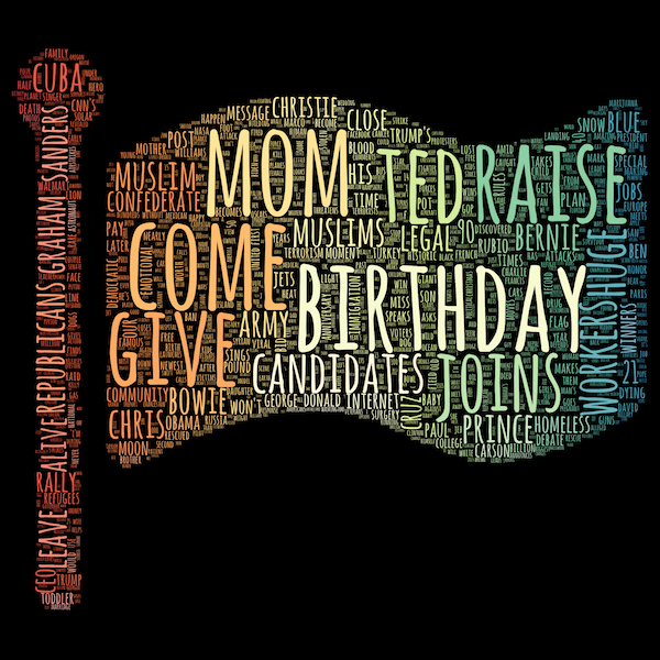
Why not create a word cloud of news headlines to get a zeitgeist of popular discussion? To do this, I scraped all the public posts from CNN’s Facebook page, and created a word cloud of all CNN headlines to which the posts link. Let’s use the Google Font Amatic SC which you’ve likely seen before in ads, and let’s try a qualitative palette, Dark2, to get a “rainbow” effect without looking gawdy.
And use a flag icon, because why not?
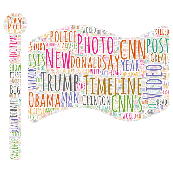
Of course, CNN has had fun with the 2016 U.S. Presidential election.
Let’s do one more word cloud. We have not yet done a word cloud using the colors-from-original-image technique. Using the underlying matplotlib color map for the Spectral palette, we can overlay a spatial rainbow which determines the color of the words displayed at that area of the mask:

Additionally, in order to estimate the importance of the presence of each word in generating Reactions, we can create a word cloud of the words where the words are sized not by count, but by the average number of Reactions on Facebook posts referencing CNN headlines containing that word (where the word is used in at least 20 headlines for some statistical correction). And let’s try a black background.
While the word cloud cannot be output in a vectorized format using this method, creating a word cloud at a super-high resolution (even larger than 2048x2048px) is more-than-enough for making typical wall posters and t-shirts.
Word clouds may not have as much explanatory value in the academic sense, but they have persuasive power, which is just as important. At the least, it’s another visual technique in my fun bag of visualization tricks to spice up future blog posts.
Performing postprocessing on rendered word clouds can help create especially artsy art, but that discussion best-saved for another time.
You can view the scripts to create the word clouds in this posts in this GitHub repository; the code is more hacky than usual, but it should be clear enough to demonstrate how the raw data was processed in each instance and how the word clouds were rendered. In the future, I hope to create a Flask app based on these scripts to streamline the creation of word clouds.
