Network graphs are pretty data visualizations, and I like pretty data visualizations. Recently, Reddit user CuriousGnu posted a network graph of the comment patterns of the top 50 Reddit subreddits:
The visualization was made with Gephi, a very popular free and open-source network graph tool.
Gephi is extremely difficult to use, and most blog posts about the software are in the form of Step 1: Gephi, Step 2: ???, Step 3: Profit. Even if you know do how to use it, most of the network design customizations must be done manually, which is not helped by software slowness even on high-end machines. My own attempts to use Gephi for nice-looking networks have had mixed results.
Additionally, there is very little discussion on how to gather the data for large-scale network graph visualizations, and how to make them in a reproducible manner. It is time to fix that and create a Reddit network graph visualization with many more nodes, step by step.
Getting Reddit Edge Data
Network graphs are typically formed by getting the relationship data between two entities (the edges), then extrapolating the vertices of the graph (the nodes) from that data.
There are two common data structures for representing edge data. One is an adjacency matrix, which is a 2D matrix where the rows/columns represent the entities, and the value at the intersection between a row/column represents the weight of the relationships. For the visualization above, CuriousGnu made an adjacency matrix by querying the relationships from BigQuery for each subreddit manually. That requires adding a line of SQL for each subreddit you want to plot, which is time-consuming and I am lazy.
Let’s try option #2: an edge list, which is a tabular dataset where each row contains the two entities and a weight. With clever use of BigQuery, we can query the edges for every single subreddit at the same time. And we can query on real-time Reddit data from approximately the past 6 months using Jason Baumgartner’s Reddit dataset on BigQuery.
The process works like this:
- Determine active users of a subreddit by identifying the subreddits where a user has commented on at least 5 different submissions within the past 6 months.
- Perform a self-join by joining the table on itself: this will create links between all subreddits where a given user is active. (e.g. an active user of /r/askreddit, /r/pics, and /r/gifs will form 9 links: askreddit → askreddit, askreddit → pics, askreddit → gifs, pics → askreddit, etc.)
- Aggregate the counts of the number of links between two subreddits; this will become the edge Weight.
- Filter the resulting dataset by removing self-loops and reverse-edges. (e.g. since we have askreddit → pics, remove pics → askreddit). Additionally, we should only retain edges with at least 200 active users to keep the resulting dataset a manageable size for this analysis.
Putting it all together results in this query:
SELECT a.l_subreddit as Source, b.l_subreddit as Target, COUNT(*) as Weight
FROM (
  SELECT author, LOWER(subreddit) as l_subreddit, COUNT(DISTINCT(link_id)) as unique_threads
  FROM [pushshift:rt_reddit.comments]
  GROUP BY author, l_subreddit
  HAVING unique_threads >= 5) a JOIN (
  SELECT author, LOWER(subreddit) as l_subreddit, COUNT(DISTINCT(link_id)) as unique_threads
  FROM [pushshift:rt_reddit.comments]
  GROUP BY author, l_subreddit
  HAVING unique_threads >= 5) b ON a.author = b.author
GROUP BY Source, Target
HAVING Source < Target AND Weight >= 200
ORDER BY Weight DESC
Only 13 lines of code, with 3 of those lines repeated. Running the query only takes a few minutes. (which is actually forever in BigQuery time: when people talk about “big data,” this is actually big data!)
That query (at the time of analysis) returns this dataset of 7,498 edges; more than enough. Now for the fun part.
Visualizing the Reddit Data
The edge list linked above can actually be imported into Gephi as-is. Don’t.
Instead, let’s use R and my favorite data visualization tool ggplot2, with a twist.
First, we load the edge list into R, and create an undirected network graph using the igraph package.
net <- graph.data.frame(df, directed=F)
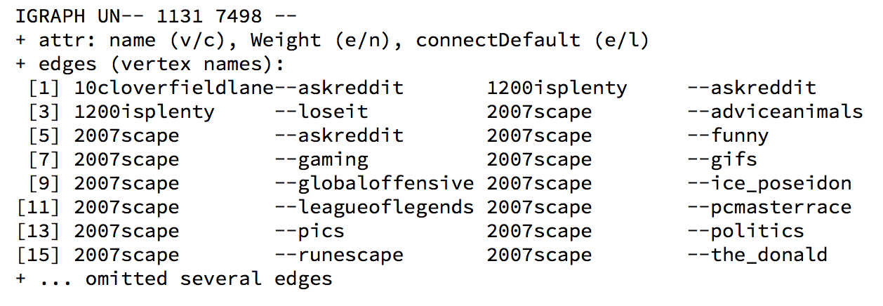
The imported edge list results in a network with 1,131 nodes/subreddits. After pruning nodes with only a few neighbors and removing the subsequently-orphaned edges, we get a network of 517 nodes/subreddits with 6,732 edges.
We can then add summary statistics for the nodes, such as the group/community each node belongs to, and the eigenvector centrality of the node.
V(net)$group <- membership(cluster_walktrap(net, weights=E(net)$Weight))
V(net)$centrality <- eigen_centrality(net, weights=E(net)$Weight)$vector
Convert the network to a dataframe suitable for plotting using the ggnetwork library.
df_net <- ggnetwork(net, layout = "fruchtermanreingold", weights="Weight", niter=50000)
Now time for ggplot2/ggnetwork fun. In this case, we will color the nodes whether or not they are a default subreddit (orange if default, blue otherwise) and color the lines accordingly (orange if either end is a default subreddit, blue otherwise).
Yes, writing and optimizing all of this code is significantly easier than using Gephi, believe it or not.
default_colors=c("#3498db", "#e67e22")
default_labels=c("Not Default", "Default")

ggplot(df_net, aes(x = x, y = y, xend = xend, yend = yend, size = centrality)) +
    geom_edges(aes(color = connectDefault), size=0.05) +
    geom_nodes(aes(fill = defaultnode), shape = 21, stroke=0.2, color="black") +
    geom_nodelabel_repel(data=df_net, aes(color = defaultnode, label = vertex.names),
                          fontface = "bold", size=0.5, box.padding = unit(0.05, "lines"),
                          label.padding= unit(0.1, "lines"), segment.size=0.1, label.size=0.2) +
    scale_color_manual(values=default_colors, labels=default_labels, guide=F) +
    scale_fill_manual(values=default_colors, labels=default_labels) +
    ggtitle("Network Graph of Reddit Subreddits (by @minimaxir)") +
    scale_size(range=c(0.1, 4)) +
    theme_blank()
The large networks in the blog post are rendered as a PDF, which allows for easy pan/zooming at a very low file size (284KB!), while SVG/d3/sigma.js approaches have very poor performance at large numbers of nodes/edges.
As we expect, the default subreddits are in the center of the network graph and have high centrality (although /r/art and /r/earthporn are oddly far separated from the other defaults). The large amounts of orange graph-wide illustrate the breadth of the defaults.
Now let’s color the nodes and edges by group, just as you saw in the introductory visualization:
If an edge links to a node of the same group, the edge is colored that group. Otherwise, the edge is colored gray. (the code that implements this is not shown because it is somewhat convoluted). This color scheme helps gauge the overall impact of the communities on Reddit. But why not look at specific groups?
Subgraph Surprises
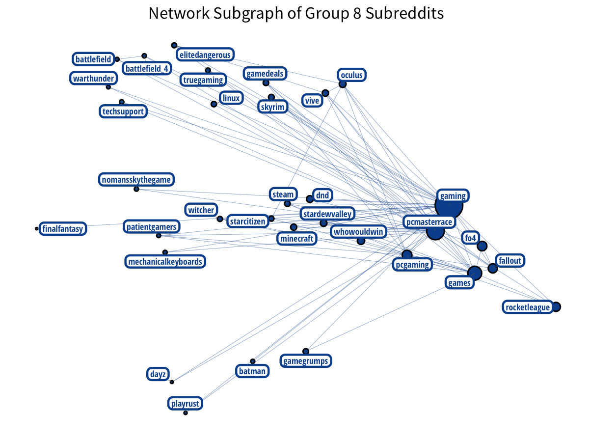
As you can see plainly in the group-colored visualization, there is a giant green group at the center which includes the default subreddits. Analyzing that is not helpful. But we can filter the network on other specific groups and their subgraphs to see if we can define any Reddit subcultures. (note that the Group number is merely an ID; the value and order are not relevant).
The most notable Reddit groups are gaming groups. We have two distinct groups of gamers:
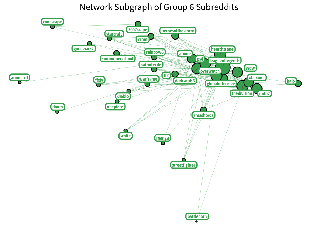
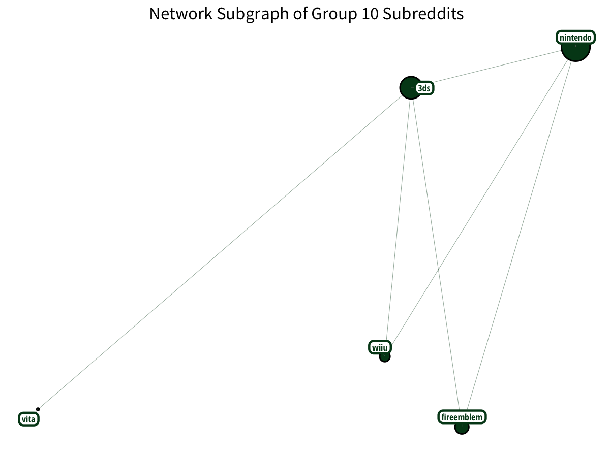
Plus Nintendo gamers? With a little Vita on the side?
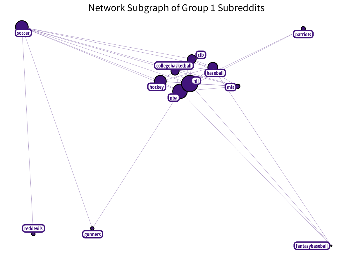
Subreddits related to sports and sporting teams form a nice cluster:
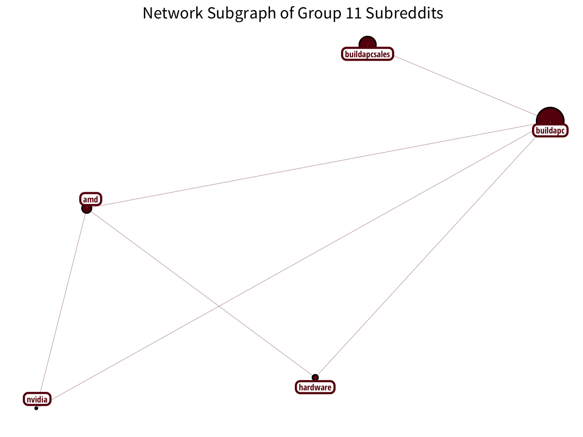
PC-building has a distinct community:
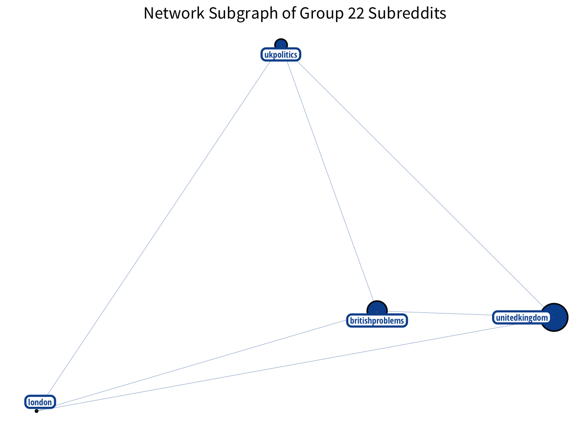
The British make nice triangles!
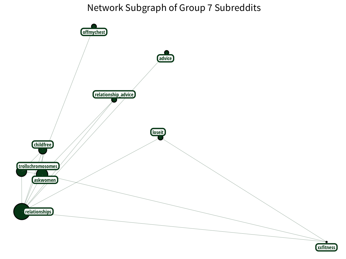
Relationship and female-oriented subreddits have a relationship.
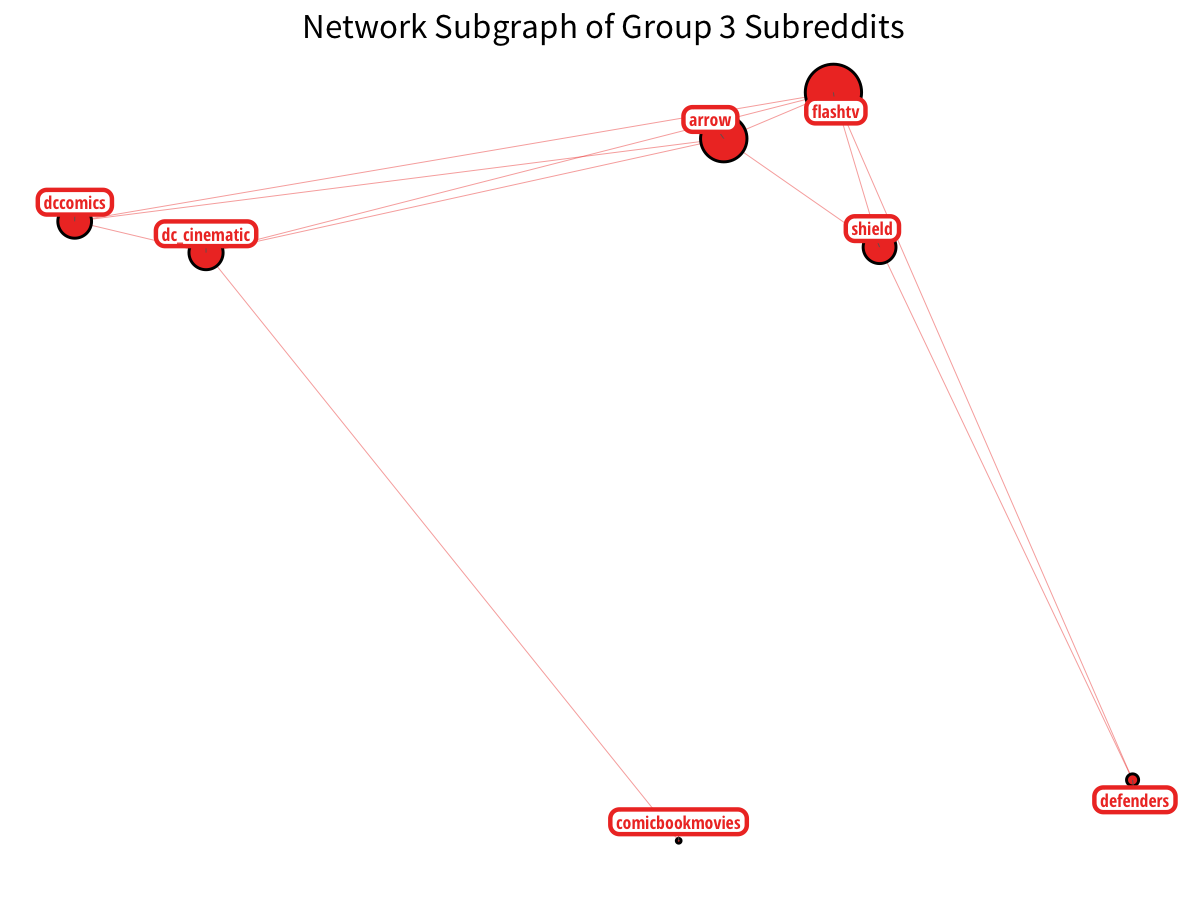
Lastly, DC Comics has their own sector, particularly with the corresponding CW television shows. (although some Marvel shows sneak in!)
Of course, Reddit itself has better data for identifying relationships between subreddits, as they can track user activity more intimately. Meanwhile, the output for this post turned out better than expected and I hope to include similar visualizations in future blog posts. Hopefully, it dispelled some of the mystery behind pretty network graphs. (if you do use the code or data visualization designs from this post, it would be greatly appreciated if proper attribution is given back to this post and/or myself. Thanks!).
As always, the full code used to process the edge list and generate the visualizations is available in this Jupyter notebook, open-sourced on GitHub.
Additionally, thanks to Professor James P. Curley of Columbia University for providing helpful slides which have good code samples for getting started with igraph/ggnetwork.