This post uses the #legacySQL dialect of BigQuery SQL.
While working on my statistical analysis of 142 million Reddit submissions last year, I had a surprising amount of trouble settings things up. It took a few hours to download the 40+ gigabytes of compressed data, and another few hours to parse the data and store in a local database. Even then, on my old-but-still-pretty-fast desktop PC, simple queries on the entire dataset took minutes to run, with complex queries occasionally taking upwards to an hour.
Over the past year, I’ve had a lot of success using Google’s BigQuery tool for quick big data analysis without having to manage the data, such as the recent NYC Taxi data dump. Recently, Jason Michael Baumgartner of Pushshift.io (a.k.a /u/Stuck_In_The_Matrix on Reddit), who also provided me the original Reddit data, released new Reddit datasets containing all submissions and all comments until August 2015. Google BigQuery Developer Advocate Felipe Hoffa uploaded the dataset to a public table in BigQuery for anyone to perform analysis on the data.
With Reddit data in BigQuery, quantifying all the hundreds of millions of Reddit submissions and comments is trivial.
Hello Reddit!
Although the data is retrieved and processed in seconds, making the data visualizations in this post takes slightly longer. You can view the R code needed to reproduce the visualizations in this Jupyter notebook open-sourced on GitHub.
BigQuery allows 1 terabyte (1000 GB) of free data processing per month; which is much more than it sounds like, and you’ll see why.
BigQuery syntax works similar to typical SQL. If you can perform basic SQL aggregations such as COUNT and AVG on a tiny database, you can perform the same aggregations on a 100+ GB dataset.
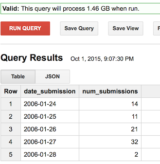
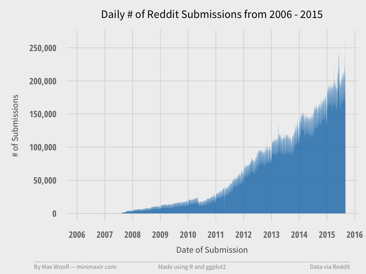
We can write a simple query to just calculate how many Reddit submissions are made each day, to both check the robustness of the data, and to show how much Reddit has grown. (note that the created field is in seconds UTC; you will need to convert it to a timestamp, then convert to a DATE which converts the timestamp to a YYYY-MM-DD string, which is the format you want since it sorts lexigraphically)
SELECT DATE(SEC_TO_TIMESTAMP(created)) date_submission,
COUNT(*) as num_submissions
FROM [fh-bigquery:reddit_posts.full_corpus_201509]
GROUP BY date_submission
ORDER by date_submission
Which results in a simple timeseries, as shown above. BigQuery allows you to download the data as a CSV, and it can easily be visualized in any statistical program such as Excel.
Of course, I prefer R and ggplot2.
And that query only took 4.5 seconds to complete, with 1.46 GB data processed! BigQuery only counts the columns used in the query against the 1 TB quota; since the query only used one small column, the query is cheap. (if the query hits the raw submission title/comment text data, then the queries will be significantly larger data-wise)
When is the best time to post to Reddit?
One of the reasons people might look at Reddit data is for determining the best way to viral. One of the most important factors in making something go viral is timing; since Reddit has a ranking system based on both community approval and time-since-submission, along with the fact that there is more activity at certain times of the day, the time when a submission is made is especially important.
So here’s another aggregation query that aggregates on the day of week a submission is made, and the hour when the submission is made; this creates a 7x24 matrix of timeslot possibilities. Both values are set to Eastern Standard Time, as U.S.-target websites tend to follow that timezone. Lastly, instead of checking the average amount of points for each submission at each timeslot (which would be skewed by the very high proportion of submissions with no upvotes), we’ll look at how many submissions go viral (>3000) at each timeslot with a conditional SUM(IF()) statement (which is equivalent to Excel’s COUNTIF conditional)
SELECT
  DAYOFWEEK(SEC_TO_TIMESTAMP(created - 60*60*5)) as sub_dayofweek,
  HOUR(SEC_TO_TIMESTAMP(created - 60*60*5)) as sub_hour,
  SUM(IF(score >= 3000, 1, 0)) as num_gte_3000,
FROM [fh-bigquery:reddit_posts.full_corpus_201509]
GROUP BY sub_dayofweek, sub_hour
ORDER BY sub_dayofweek, sub_hour
2.5 seconds, 2.39 GB processed, and a few R tricks results in this:
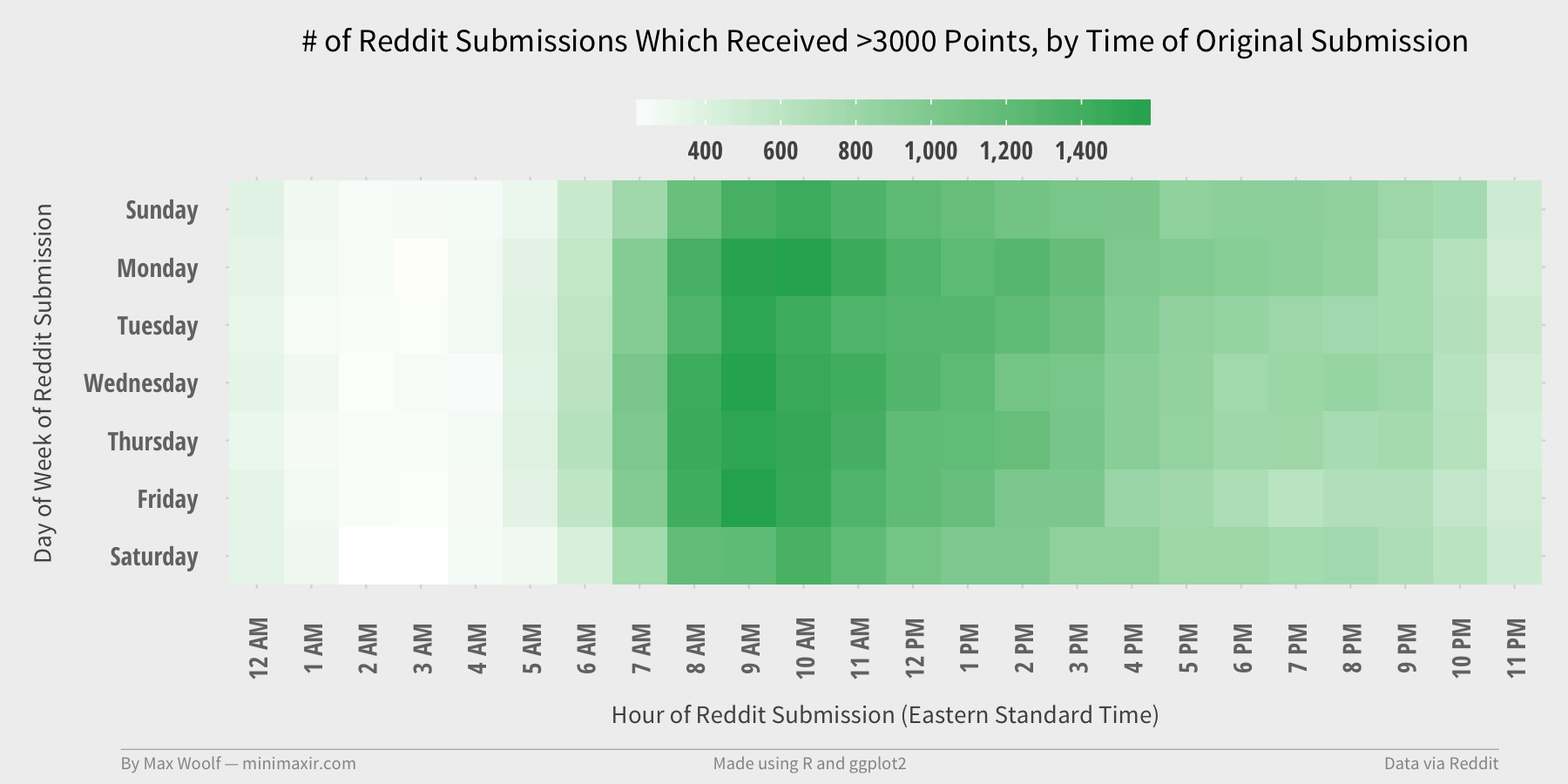
The day-of-week mostly does not matter, but hour matters significantly: about 3x as many submissions go viral when they are posted in the morning EST than if they are posted late in the day. (and rarely anything comparatively goes viral posted late at night, which is intuitive enough)
Creating Wordclouds of Subreddit Comments
Wordclouds are always a fun representation of data, although not necessarily the most quantifiable. BigQuery can help derive word counts on large quantities of data, although the query is much more complex.
Due to the amount of data, we’ll only look at the latest Reddit comment data (August 2015), and we’ll look at the /r/news subreddit to see if there are any linguistic trends. In a subquery, the comment text (from non-bots!) is stripped of punctuation, set to lower case, and split into individual words; each word is counted and aggregated.
SELECT word, COUNT(*) as num_words, AVG(score) as avg_score
FROM(FLATTEN((
  SELECT SPLIT(LOWER(REGEXP_REPLACE(body, r'[\.\",*:()\[\]/|\n]', ' ')), ' ') word, score
  FROM [fh-bigquery:reddit_comments.2015_08]
  WHERE author NOT IN (SELECT author FROM [fh-bigquery:reddit_comments.bots_201505])
  AND subreddit="news"
  ), word))
GROUP EACH BY word
HAVING num_words >= 10000
ORDER BY num_words DESC
5.0 seconds and 11.3 GB processed, along with removing a few stopwords via R results in this.

News is about people. And more. Makes sense. (An avg_score column for each word is included to allow for emulation of quantifiable impact of a given word, as used in my BuzzFeed analysis, although that is less useful for comments than submissions.)
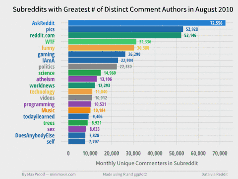
Monthly Active Users
Although Reddit does provide a count of Subscribers for a given subreddit, most of those users are passive. One of the most important metrics of any startup is Monthly Active Users (MAUs), which we can get a reasonable approximation using the comment data. And not only that, we can aggregate the unique number of commenters by a given subreddit and by a given month, to see how subreddit activity changes over time relative to other subreddits.
How this works in BigQuery is a little more complicated, and requires the use of window functions:
- Aggregate by subreddit, month, and count of unique comment authors on all comments (this will result in a query with a lot of data processed!)
- For each month, rank the subreddits by number of unique authors.
- Take the top 20 subreddits by rank for each given month.
SELECT subreddit, date, unique_authors FROM
(SELECT subreddit, date, unique_authors, ROW_NUMBER() OVER (PARTITION BY date ORDER BY unique_authors DESC) rank FROM
(SELECT subreddit, LEFT(DATE(SEC_TO_TIMESTAMP(created_utc)), 7) as date, COUNT(UNIQUE(author)) as unique_authors FROM TABLE_QUERY([fh-bigquery:reddit_comments], "table_id CONTAINS '20' AND LENGTH(table_id)<8")
GROUP EACH BY subreddit, date
))
WHERE rank <= 20
ORDER BY date ASC, unique_authors DESC
11.9 seconds and 53.3 GB (!) later, we can create a Top 20 Subreddits visualization for each month, and combine each image into a GIF with my trusty Convert Frames to GIF tool.
You can view the individual frames in the project GitHub repository. There are many trends revealed, such how some subreddits die over time (r/fffffffuuuuuuuuuuuu, /r/technology), how some rise over time (/r/pcmasterrace), and how some subreddits have relative monthly spikes (/r/thebutton). Note that the colors have no visual meaning but are used to help easily differentiate between subreddits.
These sample queries are only a small sample of what can be done with the Reddit data and BigQuery. Although some data scientists may argue that using is BigQuery is pointless since ~200GB of data can fit in RAM, the quick, dirty, and cheap option is much more pragmatic for the majority of potential data analysis on this Reddit dataset.
Again, you can view the R code needed to reproduce the visualizations in this Jupyter notebook.