A few days ago on Hacker News, I saw a nice submission titled “Statistics for Hackers,” which was a slide deck written and presented by Jake Vanderplas. The talk is very explicitly a tutorial for a few good statistical methods for those without a statistical background, using simple tools “hackers” are familiar with and are occasionally very necessary (it’s not hacking in the sense of “growth hacking,” thankfully).
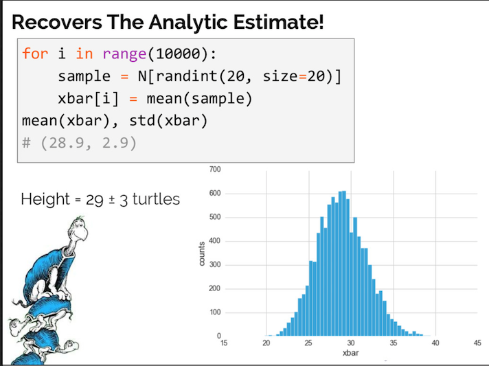
One important statistical tool discussed in the presentation is bootstrap resampling, a good example for a programming-oriented presentation as it can be easily done with code. Bootstrapping is when a data set is randomized many, many times (usually thousands of times) to simulate similar data sets, and use those simulated datasets to obtain a more accurate range for a particular statistic about the data set, such as the statistical average.
I have reverse-engineered the data and code from the talk with R and ggplot2 in order to create more detailed implementations of bootstrapping, and also to add a few visual improvements.
Preparing the Data
If you want to view the code with more detailed output and extensive code for the ggplot2 charts, read this Jupyter notebook, hosted and open-sourced on GitHub.
The first thing to do is recreate the test data.
Data is manually transcribed from the linked talk (to the best of my ability), and converted to a tbl_df for ease of use.
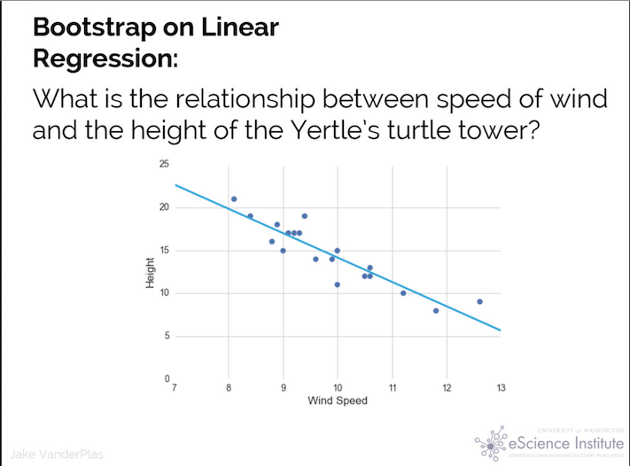
x <- c(8.1, 8.4, 8.8, 8.7, 9, 9.1, 9.2, 9.3, 9.4, 9.6, 9.9, 10, 10, 10.5, 10.6, 10.6, 11.2, 11.8, 12.6)
y <- c(21, 19, 18, 16, 15, 17, 17, 17, 19, 14, 14, 15, 11, 12, 12, 13, 10, 8, 9)

df <- tbl_df(data.frame(x,y))
Let’s create a quick plot in ggplot2 to compare it to the source image:
qplot(x, y, df) + geom_smooth(method="lm")
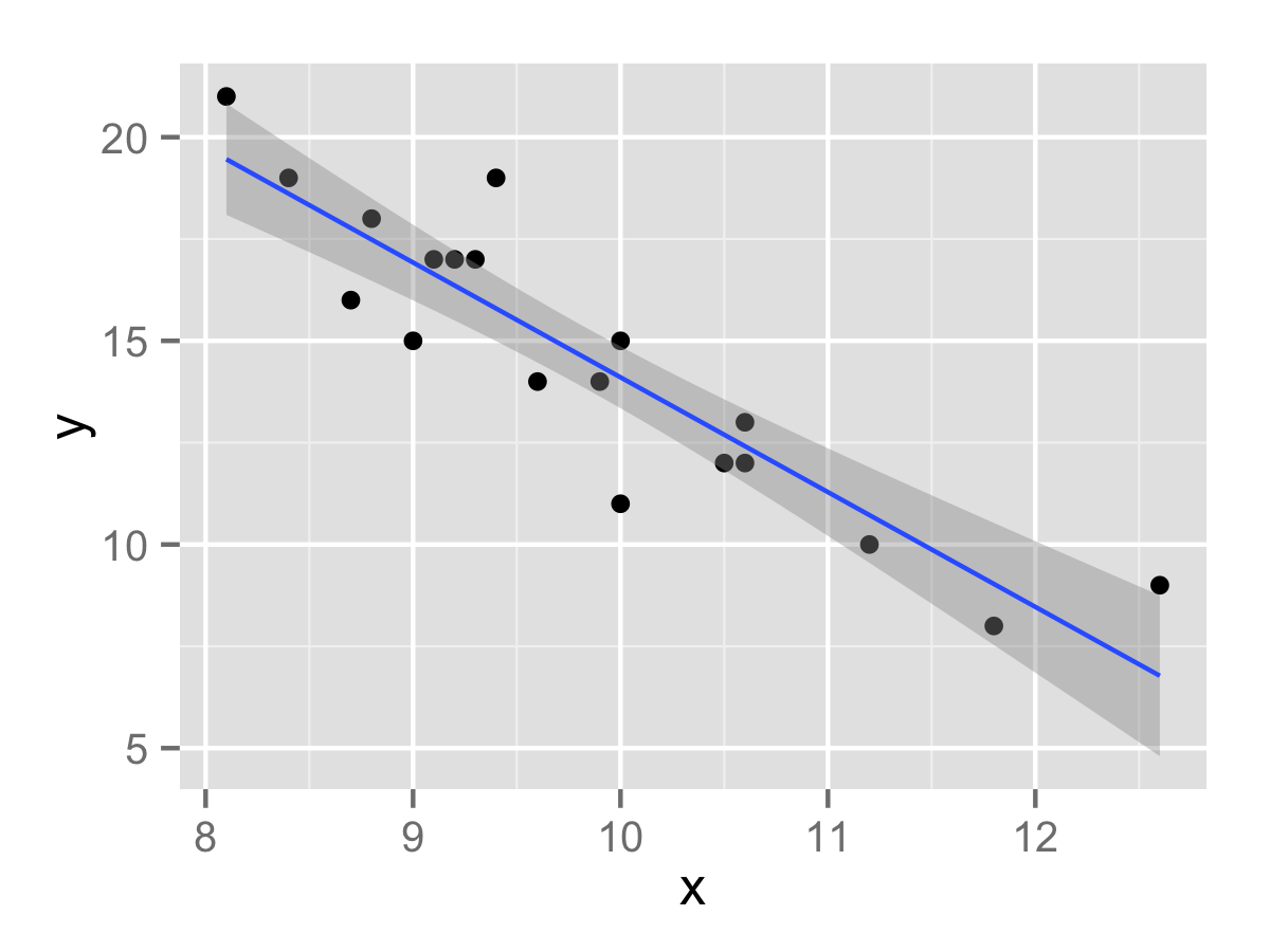
Pretty good copy, and it comes with a linear regression line for one line of code!
Performing the linear regression within R itself (via lm()) results in a model containing an X-intercept of 42.3 and a slope of -2.81. (y = 42.3 - 2.81x)
- 42.3, the coefficient for the (Intercept), represents the value of the stack if Wind Speed is 0.
- For every 1 unit increase in Wind Speed, the estimated Height decreases by 2.81, the coefficient for the
xvariable.
Both coefficients are extremely statistically significant. Regression as a whole has a R2 of 82.71%; indicating that the change in Wind Speed explains 82.71% of the variation in Height. That’s enough to assert causality in this mock data.
Now we can know the true value of the coefficients for the data, we can perform bootstrapping. We can create a function to perform a linear regression on the data frame, having been resampled with replacement (important!), and return the model coefficients:
lm_res <- function(df) {
    model <- lm(y ~ x, df %>% sample_frac(replace=T))
    return (model$coefficients)
}
R’s replicate function runs a function a specified amount of times and stores the results in the same data frame; perfect for bootstrapping.
There’s no limit to the number of repetitions you can perform using this method; however, you can hit diminishing returns as the distribution converges. Generally, 2,000 trials minimum are recommended, but let’s do 10,000 trials just to be sure.
df_boot <- replicate(10000, lm_res(df))
df_boot <- tbl_df(data.frame(t(df_boot)))
This completed in about 13 seconds on my computer, and results in a dataset of 10,000 pairs of X-intercept and wind speed coefficients!
Now we can build 95% confidence intervals for each coefficient. This is done by finding the 2.5% quartile, and the 97.5% quartile; since there are a very large amount of bootstrapped samples, the confidence interval will be very accurate.
This can be done easily using the gather() function from tidyr to convert the data from wide to long, and dplyr’s aggregation and summarization functions.
df_boot_agg <- df_boot %>%
                gather(var, value) %>%
                group_by(var) %>%
                summarize(
                    average = mean(value),
                    low_ci = quantile(value, 0.025),
                    high_ci = quantile(value, 0.975)
                        )
From the output, the true value of the X intercept has a 95% chance of being between 36.9 and 49.3, and the true value of the Wind Speed coefficient has a 95% chance of being between -3.53 and -2.28.
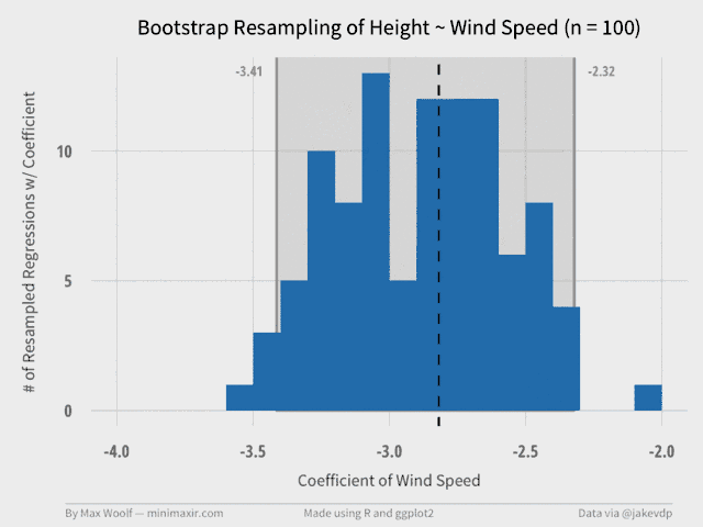
Plotting the Bootstrap of One Variable
The Wind Speed coefficient is much more interesting, statistically. We have enough information to derive a ggplot2 histogram of the resampled data, and a graphical representation of the confidence interval. We can also include the true value of the coefficient in the visualization (as the dotted vertical line) to see if it make sense.
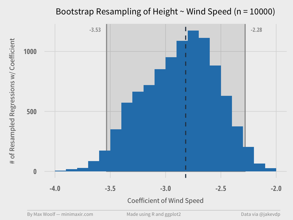
Plot is close to a Normal distribution / bell curve, which is a nice property of bootstrapping and makes the results easier to analyze. The true coefficient value is in the interval, but not quite at the center.
We can write a function to generate a plot for different data size subsets (e.g. 100 samples, 200 samples, etc. up to 10,000 samples). This shows the impact of bootstrapping and how the confidence estimate intervals converge as the number of trials increases. Each of these plots serve as a frame in a GIF.
Each of these frames are stitched together into a high- quality, low file size by my new Convert Frames to GIF OS X tool!
A 99 frame, 640px width GIF, at only half a megabyte! (R has an animation package, but with much worse results, which was the motivation for writing the OS X tool)
From the GIF, it’s clear to see that the confidence intervals converge to the final values at about 2000 trials, with the shape of the distribution stabilizing at about 7000 trials.
Plotting the Bootstrap of Two Variables
The X-intercept and the Wind Speed coefficient have a linked, negatively correlated relationship, so it makes sense to plot them simultaneously, as in the original talk.
ggplot2’s density2d plots a contour map, which will help illustrate the area and magnitude where the data converges on a 2D plane. We can also include an orange bounding box using the specified values for the 2D confidence intervals for each variable, and a red dot representing the true value of the coefficients.
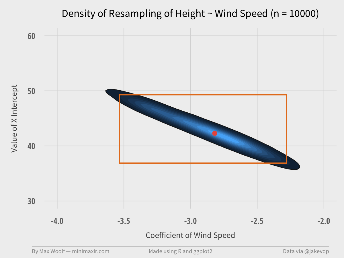
The pair of coefficients can only occur in a certain range of values, much smaller than the bounding box. The true value is close to the most frequent occurrence, too.
Then we can make another GIF using the same method:
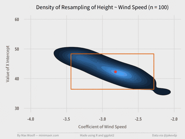
Again, the visualization converges relatively quickly at about 2,000 trials. (although, in retrospect, the orange bounding box may not have been necessary.)
While the sample dataset isn’t the most ideal for bootstrapping due to its extremely small size, bootstrapping at the least adds some clarity to the issues that results when simply performing statistics on a given dataset.
Again, if you want to view the code with more detailed output and extensive code for the ggplot2 charts, read this Jupyter notebook.