Recently, the New York City Taxi and Limousine Commission released a dataset of all Yellow Taxi and Green Taxi trips in 2014, and year-to-date in 2015, which follows the 2013 data set which was obtained to a FOIL request for the data last year. The dataset contains fun statistics, such as the location where the taxi picked up and dropped off its fare, the speed the taxi is moving, and the total fare at the end of the ride.
In the Hacker News thread announcing the data set release, user eck posted an interesting, minimalistic visualization of the taxi location data:
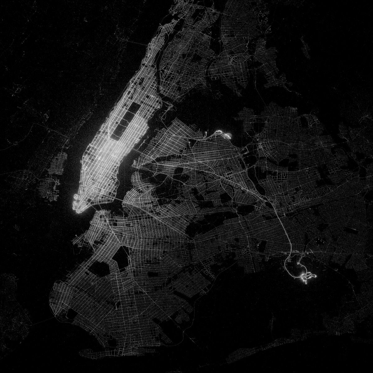
eck made the visualization using a “few hundred lines of C++”. That seemed overkill to me. So I tried to reverse-engineer his visualization using my favorite plotting tool, ggplot2. In theory, plotting a million little points in close proximity should simulate the lines of the streets of New York City.
The dataset is large (2 GB per month of data), although not “big data” large. It would take an afternoon to set up a local database, and I wanted to make pretty visualizations immediately.
Google BigQuery Developer Advocate Felipe Hoffa created a BigQuery interface for the data. BigQuery allows easy and fast access to the entire dataset for rapid processing. In my case, I need to compress the data set by truncating the latitude and longitude of the GPS coordinates to 4 digits; this allows precision to 11 meters on the coordinates, which is sufficient for estimating. Running this BigQuery query:
SELECT ROUND(pickup_latitude, 4) as lat,
ROUND(pickup_longitude, 4) as long,
COUNT(*) as num_pickups
FROM [nyc-tlc:yellow.trips_2014]
GROUP BY lat, long
Gives me data for about 1 Million GPS coordinates; more than enough to make a full map. This also has the benefit of fitting into memory, which is necessary for use with ggplot2.
My first attempt, where I plot 1 million very small white points on a black map bounded to the latitude/longitude coordinates of NYC, turned out pretty well, and with less than 10 lines of code.
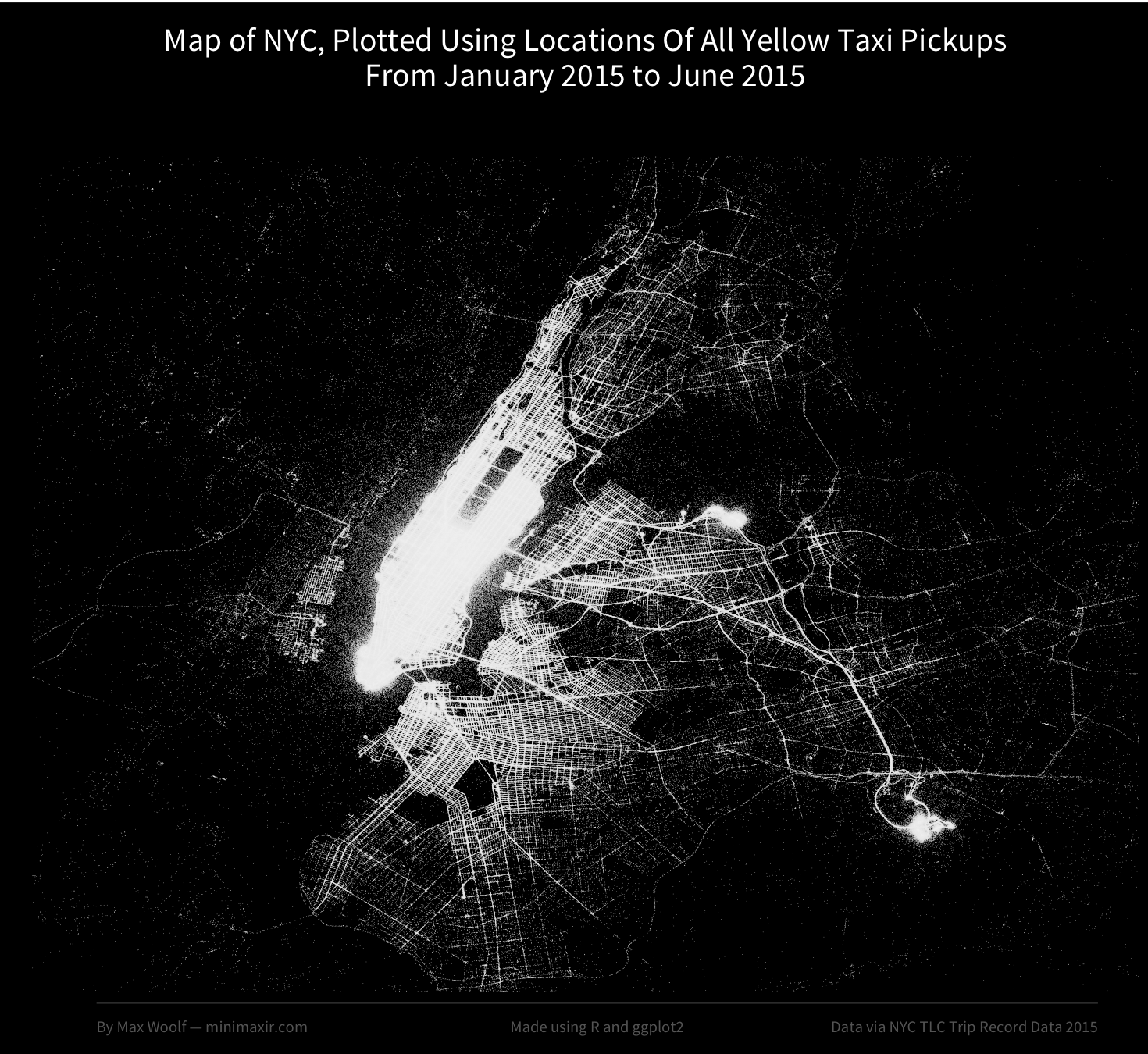
On Reddit, my submission of the data visualization received about 3,500 points, and a large amount of social media buzz on Facebook and Twitter. There were a few comments however; why were there random points in the Hudson River? Why are highways indicated as taxi pickup spots? Why does the map say “2015” when your query says “2014”? (guilty on the last one; the map was made using the 2014 dataset by accident!)
At the least, the streets of Manhattan were not discernable at all, unlike eck’s diagram. As a result, I made a few refinements to remove some logical outliers with impossible vehicle speeds, removed noisy points which were completely isolated, used the correct 2015 data set, and also added a color weighting to the data, where the most-taxi-dense areas will appear colored (scaling logarithmically) to differentate those areas from less taxi-prone areas.
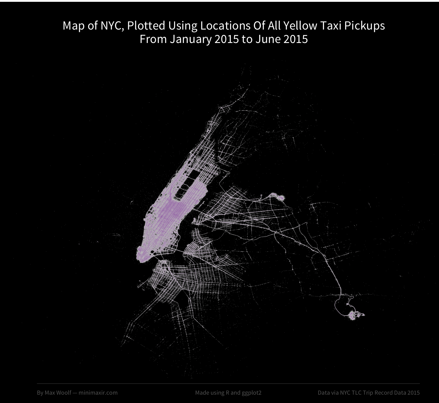
The map, while less bright, became more precise. The streets in Manhattan are now visible, and the purple color shows how Times Square and the Financial District in particular are popular taxi pickup spots in Manhattan. LaGuardia Airport and John F. Kennedy International Airport appear purple as well.
However, this map only looks at places where people picked up Taxis. Could there be a difference when plotting Taxi dropoffs instead?
I reran the query and visualization scripts on the dropoff location data instead, and as it turns out, there is a significant difference!
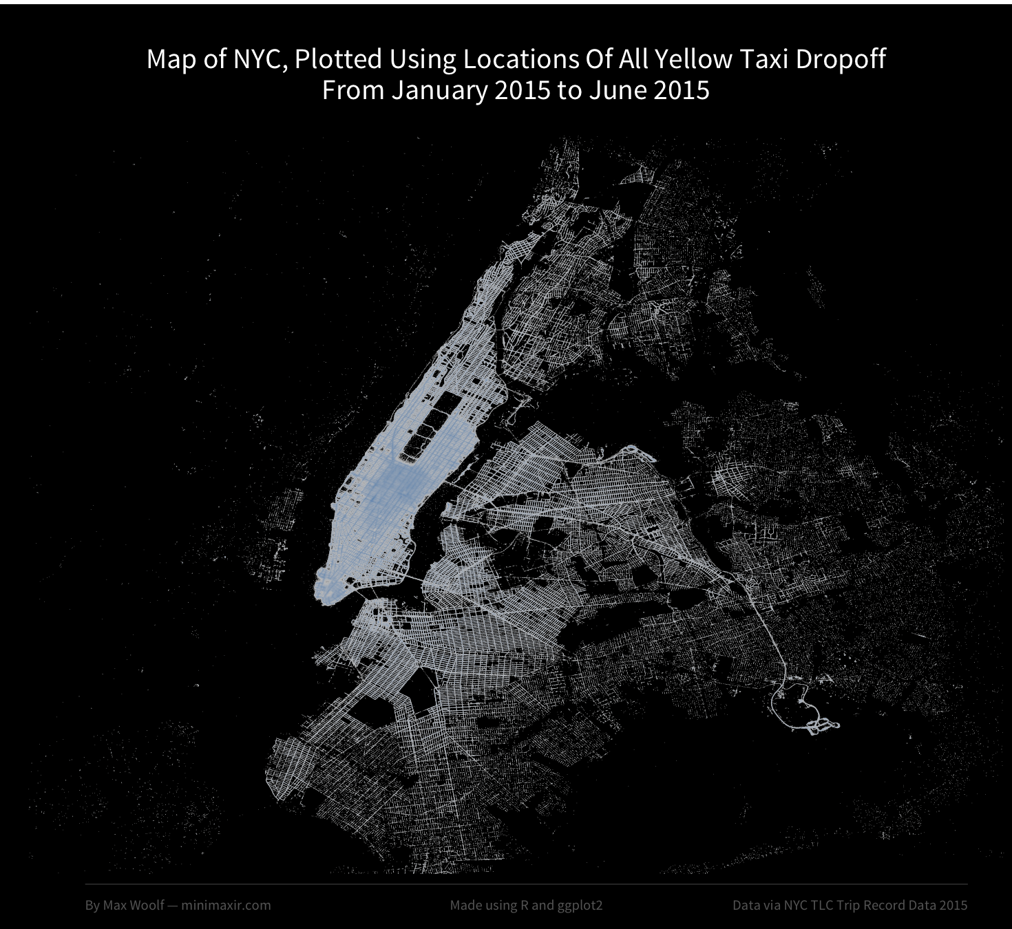
While Taxi pickups were isolated more in residential areas, taxi dropoffs can happen anywhere in the Tristate area. Additionally, the map more closely matches eck’s original visualization.
Setting up ggplot2 in this way will also allow me to perform other fun analyses in the future. For example, since we know where taxis drop off, we can determine the average speed for the trip for each significant location in NYC geography. Would the average trip speed be higher for trips that drop off at an airport due to the highway? Conversely, would the average speed be lower in Manhattan? How would fares be affected? Those are questions for another blog post. :)
Although, I still have no guesses why the highways are highlighted in both maps.
You can download a PDF of my purple pickup map (4.14 MB) and a PDF of my blue dropoff map (7.68 MB) sans text, both of which are resolution-independent and sutable for making physical prints.