Statisticians like to use data from the United States Census to plot interesting trends such as unemployment and population of regions across the country. However, such data is typically historical and not very robust.
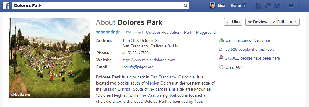
Facebook, on the other hand, has collected a large amount of data though its Places product. Facebook Places allows users to “check-in” a place such as Dolores Park in a manner similar to Foursquare.
Through clever use of Facebook’s Graph API and FQL, I was able to retrieve the data on all Facebook Places in and around San Francisco, along with the # of check-ins at each Place. With the data on approximately 8,000 Facebook Places in San Francisco, we can map where San Franciscans are checking-in, and determine what types of locations they like to visit.
First, let’s look at the distribution of check-ins among Places in San Francisco:
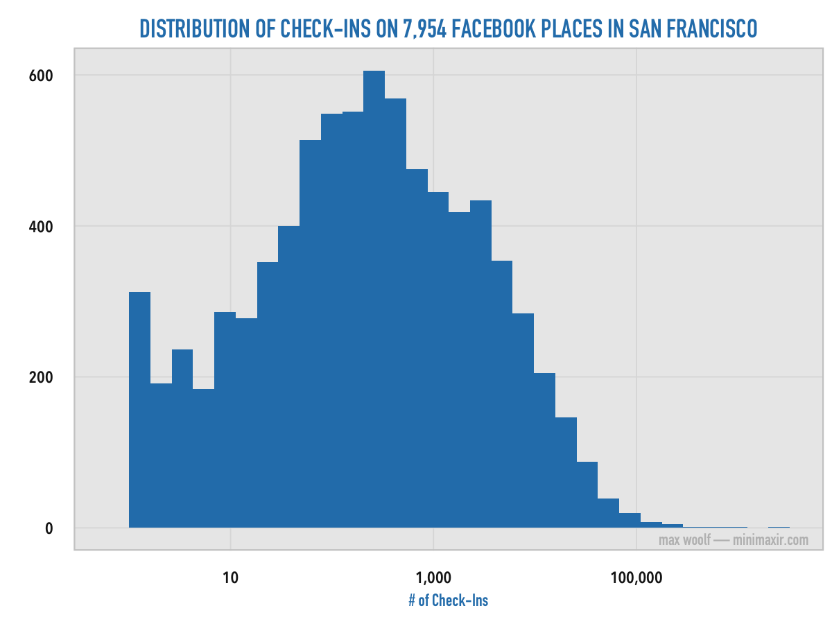
On a logarithmic scale, the shape resembles a bell curve with a center at about 800 check-ins; however, the sample average of check-ins for the data set is 3,241 check-ins, indicating that the data may be heavily skewed to the right. Some Places don’t have many check-ins, while some Places have an incredibly large number of check-ins.
What are the Places with hundreds of thousands of check-ins? What does the city look like with all these Places plotted on a map of San Francisco?
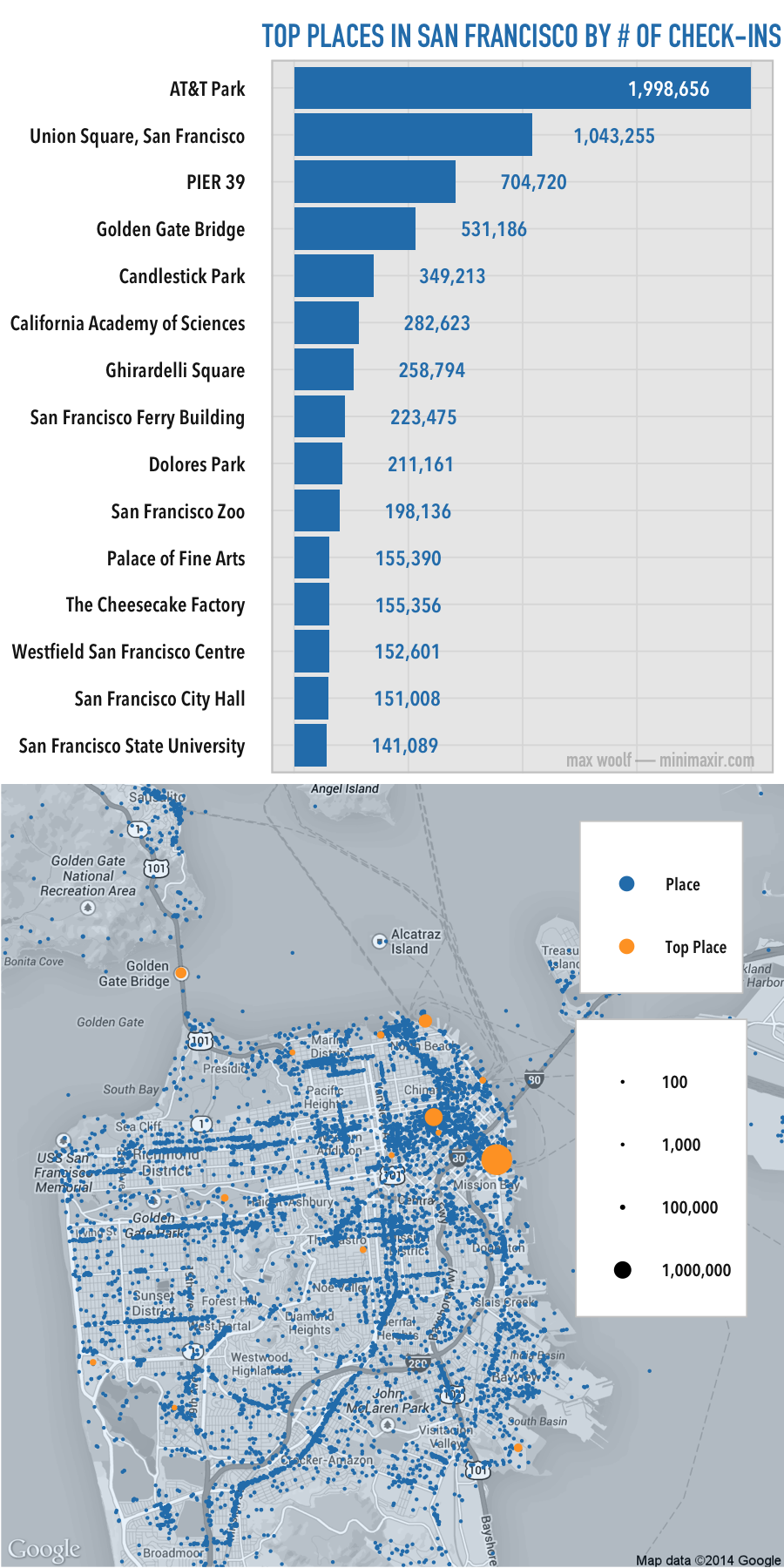
The most checked-in Places are, unsurprisingly, the famous tourist attractions of San Francisco, such as AT&T Park and Union Square. These Top Places are spread all over the city.
It’s also clear where the most dense areas are located in San Francisco. There are plainly-visible lines of Places along southern Mission Street and Outer Sunset. SOMA and Richmond have a large number of Places as well.
And yes, 155,000 people really did check-into The Cheesecake Factory.
What types of locations do people in San Francisco frequently check-into?
Facebook also records the category of its Places, such as “Bar” and “Restaurant”. What are the most numerous types of locations in San Francisco?
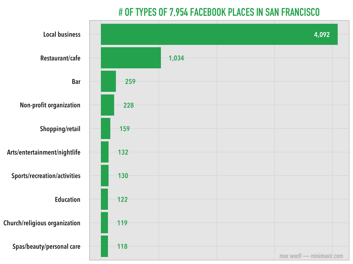
Local businesses are by far the most frequent, as it’s a more generic classifier for a Place and can be applied to anything that does not have an explicit classifier (such as startups). I find it interesting that non-profit organizations are more numerous than shopping centers.
However, the quantity of a specific type of business does not necessarily mean that San Franciscians will check-into that type of Place more often. Which type of Place, on average, receives the greatest number of check-ins?
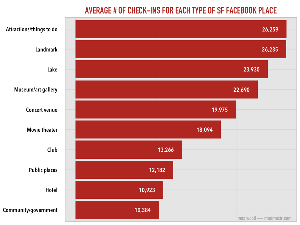
People are more likely to check-into memorable Places and events, instead of Places they frequently visit like Bars and Restaurants (Twice as many people check-into Attractions than Clubs). Again, tourist attractions are the most popular, which is due to both the relatively low number of Places and the extremely high number of check-ins into Places such as AT&T Park.
The “Lake” corresponds to Lake Merced, if you’re curious.
Which San Francisco neighborhoods are the most popular?
You saw earlier that the Facebook Places are concentrated in specific areas. Here’s a map of San Francisco’s neighborhoods, highlighted by the number of Places within:
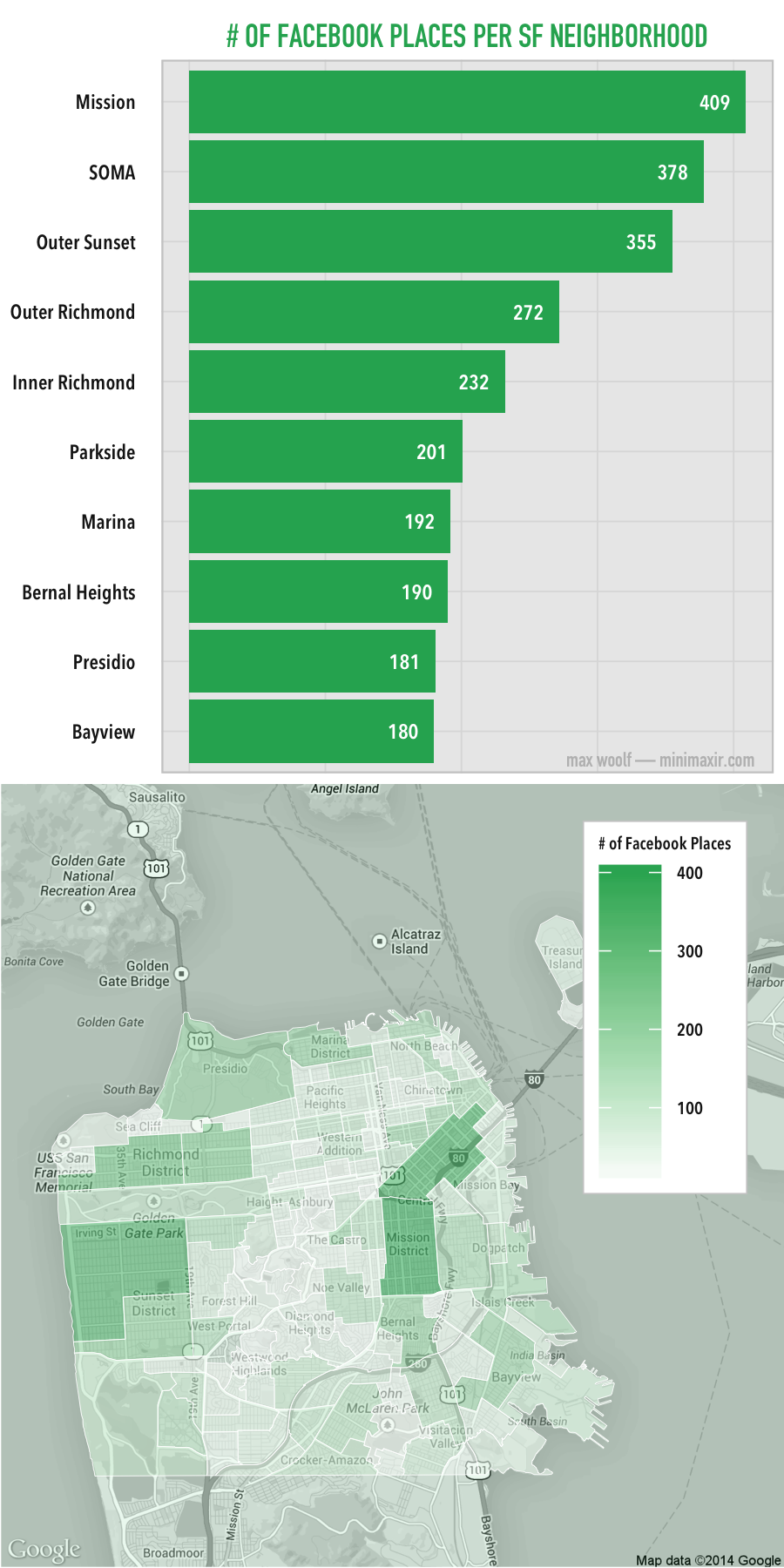
The neighborhoods with the most Places are unsurprisingly where the trendy areas are, such as the Mission and SOMA. Additionally, those types of neighborhoods are larger in square area than others, which may bias the results in their favor.
But are these large neighborhoods also the most active neighborhoods? Which neighborhoods have the most check-ins on average per Place within the neighborhood?
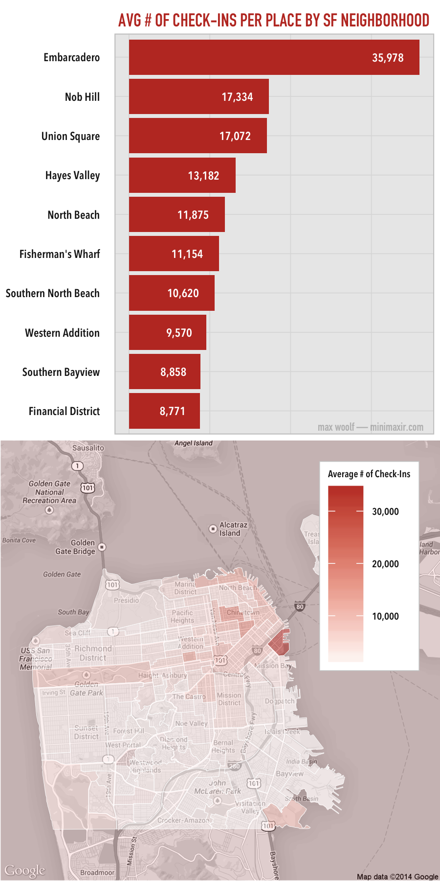
The Embarcadero has by far the most check-ins on average, again, due to both its small size and AT&T Park. Other neighborhoods, however, have more similar averages to each other. It’s worth noting that the average number of check-ins is higher in neighborhoods adjacent to the San Francisco Bay, such as North Beach and Fisherman’s Wharf: perhaps people check-in more frequently when they have a good view.
Can this data and conclusions about San Francisco Facebook Places be extrapolated to other cities? I’d argue yes: it makes logical sense that people check-in more frequently to Places that are more significant, and it also makes sense that people frequently check-into Places with large amounts of tourist attractions. Facebook data shows us cool trends that the United States Census data cannot.
All charts and maps were made using R, ggplot2, and ggmaps.
You can download a copy of the Facebook Places data set here. The place_id column corresponds to the San Francisco neighborhood where the Place is located.
Maps are from Google Maps. San Francisco shape files for city neighborhoods are from data.sf.gov. Additionally, thanks to /r/dataisbeautiful for offering ideas for improvements to the maps.
You may notice that the Check-In Counts on some of the official Facebook Place Pages strongly disagree with the Count reported in my charts. The Count reported on affected page is nearly double the value reported via the API in each instance. I believe this is a bug on Facebook’s end: see this image, in which the Graph Search autocomplete reports a different value of check-ins than the Place Page itself. In this case, I trust the data from the API.
